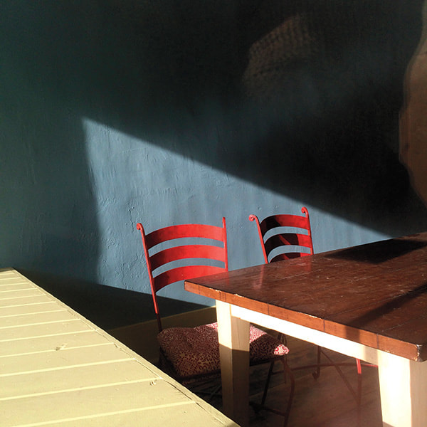
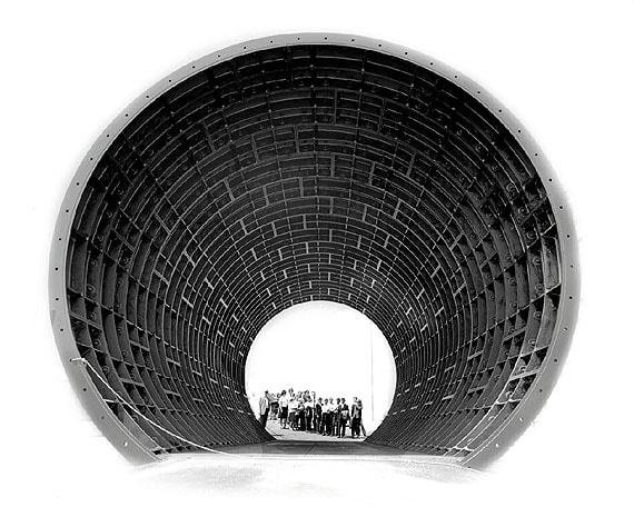
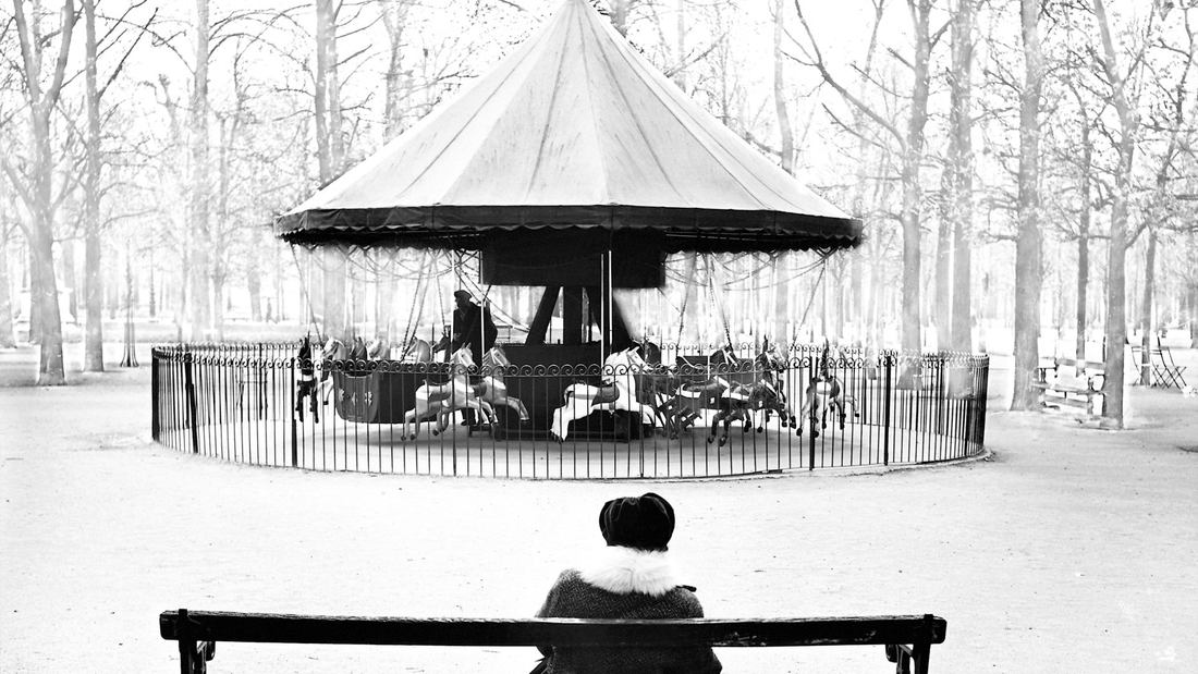
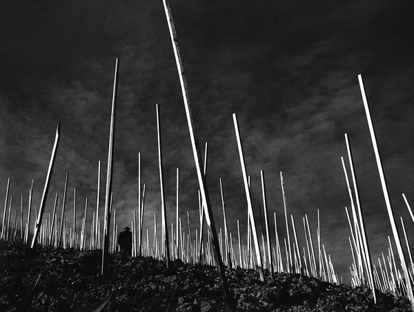
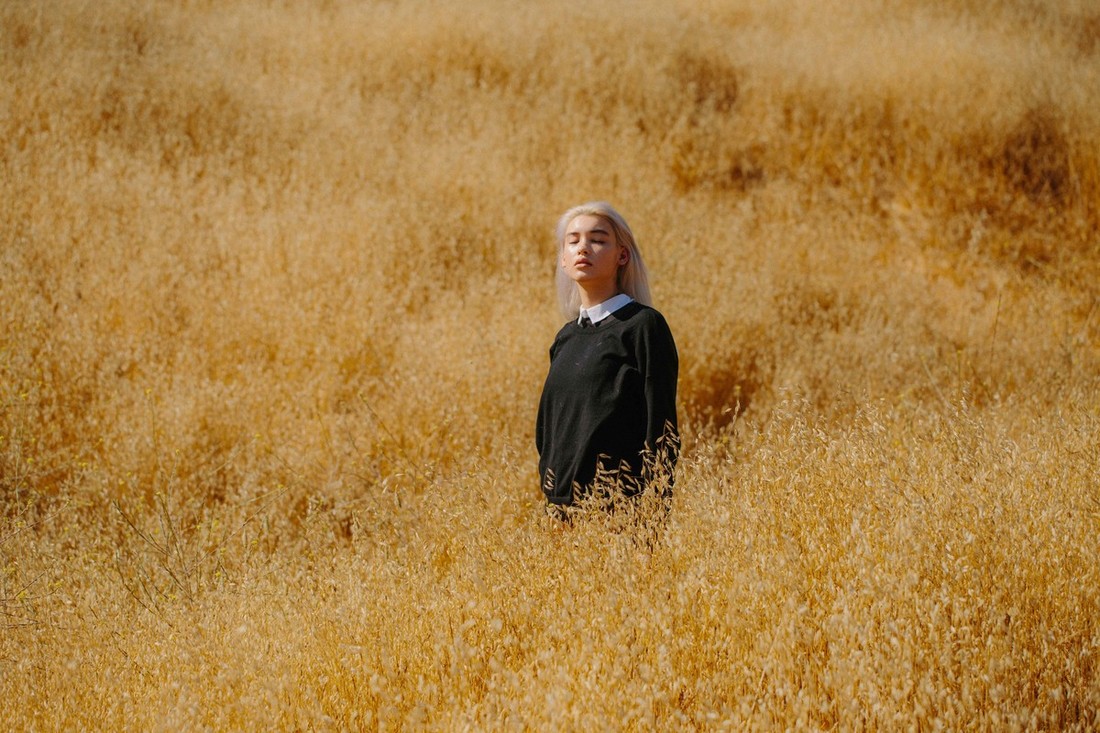
I have chosen to study the photography of unexpected perspectives, and within this, minimalism.
Minimalism; a movement in sculpture and painting which arose in the 1950s, characterized by the use of simple, massive forms.
I have chosen to study the art of minimalism, because it is a movement that I have always been interested in, even within my own artwork as well as photography.
I appreciate the simplicity of minimalism, and how it allows the enhancement of simpler things and presents them in a more interesting way which can change the viewers perspective on the world.
For example, a photo of a street taken in a minimalistic style, can completely change how people view the world around them, and help them to see the art in their surroundings.
This is something that I want to achieve with my photography, I want to change people's perspectives and present beauty in the mundane everyday.
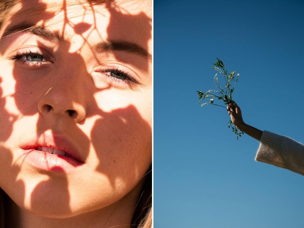
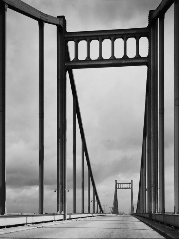
'Head height is boring. It's an all too familiar point of view of the world, with a punch pulling neutrality. Always be looking for those unfamiliar and surprising viewpoints, even if it means getting your knees dirty.' - Henry Carroll ('Read this if you want to take great photographs'- Book) - I have included this quote because it fights against the use of regular perspectives in images, therefore supporting my theme of unexpected perspectives.
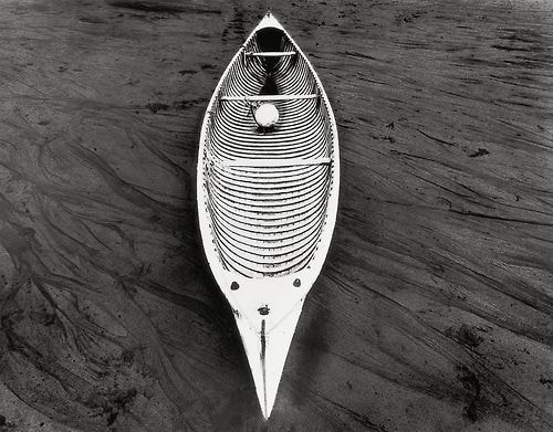
Less is more, minimalism.
Minimalism; a movement in sculpture and painting which arose in the 1950s, characterized by the use of simple, massive forms.
I have chosen to study the art of minimalism, because it is a movement that I have always been interested in, even within my own artwork as well as photography.
I appreciate the simplicity of minimalism, and how it allows the enhancement of simpler things and presents them in a more interesting way which can change the viewers perspective on the world.
For example, a photo of a street taken in a minimalistic style, can completely change how people view the world around them, and help them to see the art in their surroundings.
This is something that I want to achieve with my photography, I want to change people's perspectives and present beauty in the mundane everyday.
'Head height is boring. It's an all too familiar point of view of the world, with a punch pulling neutrality. Always be looking for those unfamiliar and surprising viewpoints, even if it means getting your knees dirty.' - Henry Carroll ('Read this if you want to take great photographs'- Book) - I have included this quote because it fights against the use of regular perspectives in images, therefore supporting my theme of unexpected perspectives.
Less is more, minimalism.
Photographer Inspirations...
Julian SchulzeJulian Schulze is a abstract and minimalistic architectural photographer.
He is from Germany and is known for his finding of colourful buildings, and the minimalistic style in which he shoots them. He believes that there are no rules to photography and how to take an image ; "I want to advocate to follow gut feelings more often, to try out different things without considering the rules" When deciding on my project topic, Schulze's photos were a large part of my inspiration to do minimalism. His images showed me how, even the simplest of photos can be powerful and charismatic. I am going to use him as one of my main photographer inspirations, and will do a shoot inspired by him. Now all I need to do is find some colourful buildings to shoot with! |
|

|
|
John BathoJohn Batho is a french photographer who creates photos with a great sense of minimalism. He is also known for his bold use of bright colours within his work.
I love his style because, although the images are simple, they are effective because of the vibrant colours and the movement/life conveyed in his photographs. I discovered Batho's photography from a book I have; 'Photographers A-Z' which is essentially a photographer dictionary. I was looking for photographers who shoot from interesting perspectives, and as soon as I came across Batho's work I was inspired to take photos in a similar style as his images are so vibrant and full of life. His style is unique in the sense that he uses primary colours (and green) in his images. This makes all his photos work cohesively as a collection and this is what I want to create within my own project. I want to do a shoot inspired by Batho and possibly do editing similar to his, as his images all have increased saturation, but also still look quite natural, just more vibrant. |

Stephen ShoreStephen Shore is a famous American photographer known for his images of ordinary scenes and objects in the United States, and for his pioneering use of color in art photography.
Stephen Shore's work has been widely published and exhibited for the past forty-five years. He was the first living photographer to have a one-man show at the Metropolitan Museum of Art in New York since Alfred Stieglitz, forty years earlier. In 2017, the Museum of Modern Art opened a major retrospective spanning Stephen Shore's entire career. He has received fellowships from the Guggenheim Foundation and the National Endowment for the Arts. His series of exhibitions at Light Gallery in New York in the early 1970s sparked new interest in color photography and in the use of the view camera for documentary work. So although Shore isn't exclusively a minimalist photographer, a lot of his photos are simple and contain key shapes like a classic minimalist photographer. Also, even his 'busier' photos have an simplistic appearance as I feel each photo has a key focus that our eyes are drawn to, disregarding the rest of the image. |
|
|
|
Uta BarthUta Barth is a photographer I have been inspired by in the past for other photography projects I've done previously.
Barth is a contemporary photographer who lives and works in Los Angeles, California. She has been taking photos for 14 years in her house, she says that she doesn't need to travel to find things to take pictures of when there is beauty all around her. I find this inspiring because it shows how its not necessary to travel and spend lots of money in order to be a successful photographer who creates amazing images. Unlike a lot of minimalist photographers, Uta Barth's images don't have harsh shapes and tones, as a lot of her photos are taken in soft focus, creating a 'Bokeh' effect. The tones in her images are also very soft and this creates a calm overall appearance, which is interesting to look at as our minds are always looking for complexities in simpler things, meaning that her images are engaging and interesting. I feel that Barth's photos tell a story and I want to create this sense of storytelling within my project. |
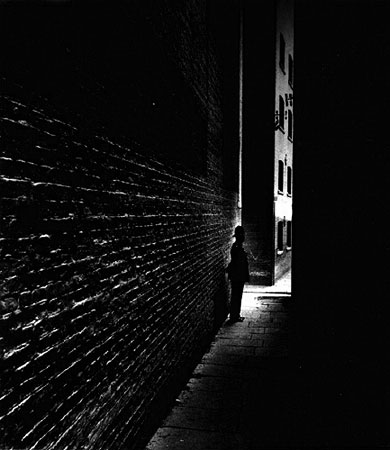
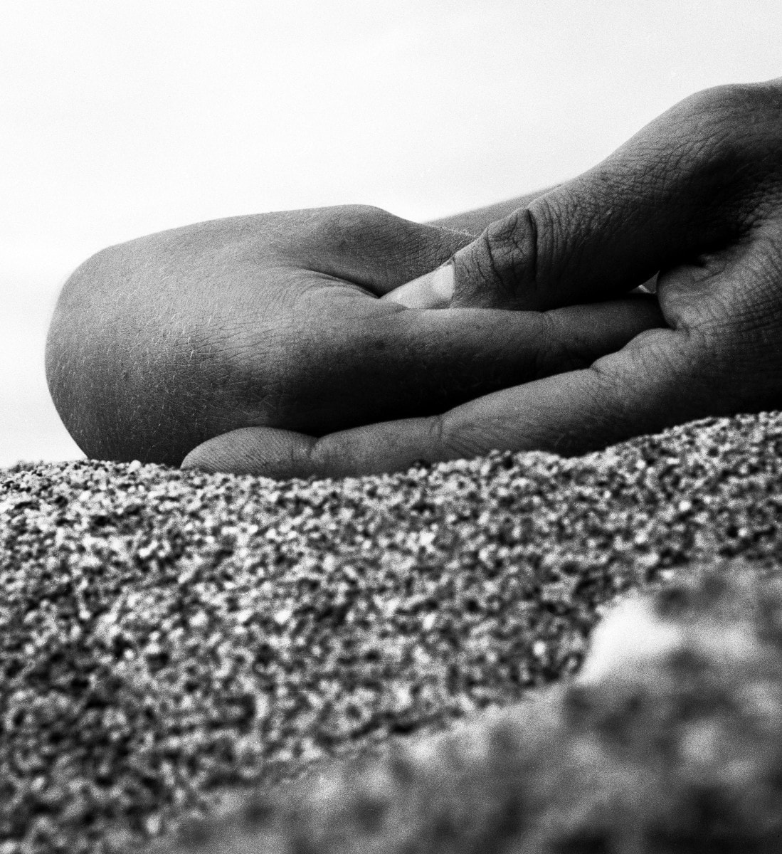
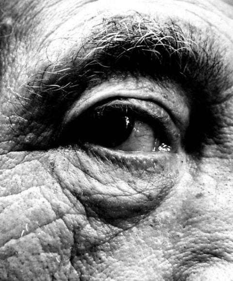
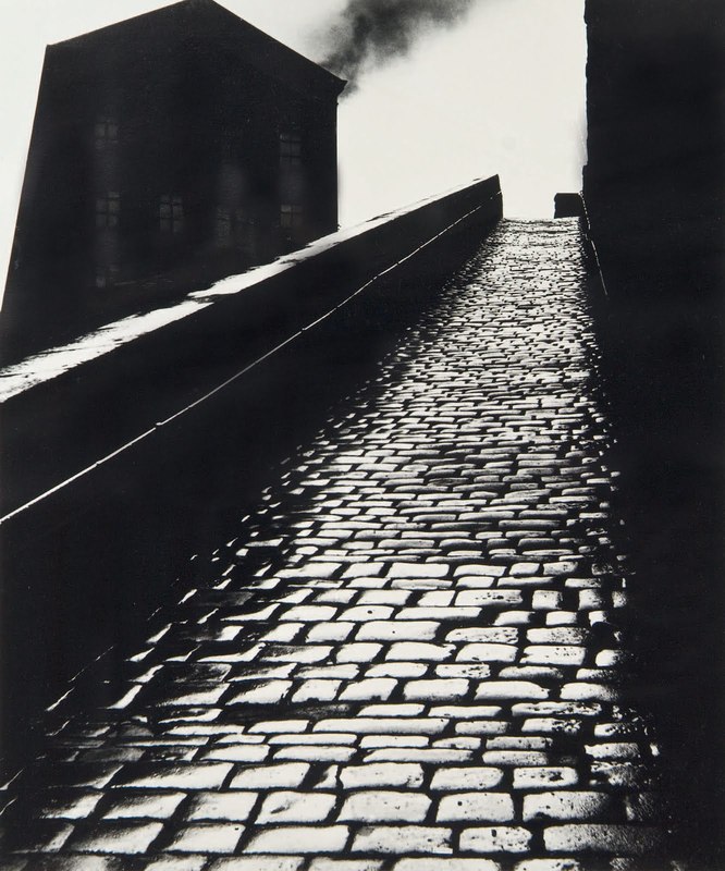
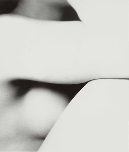
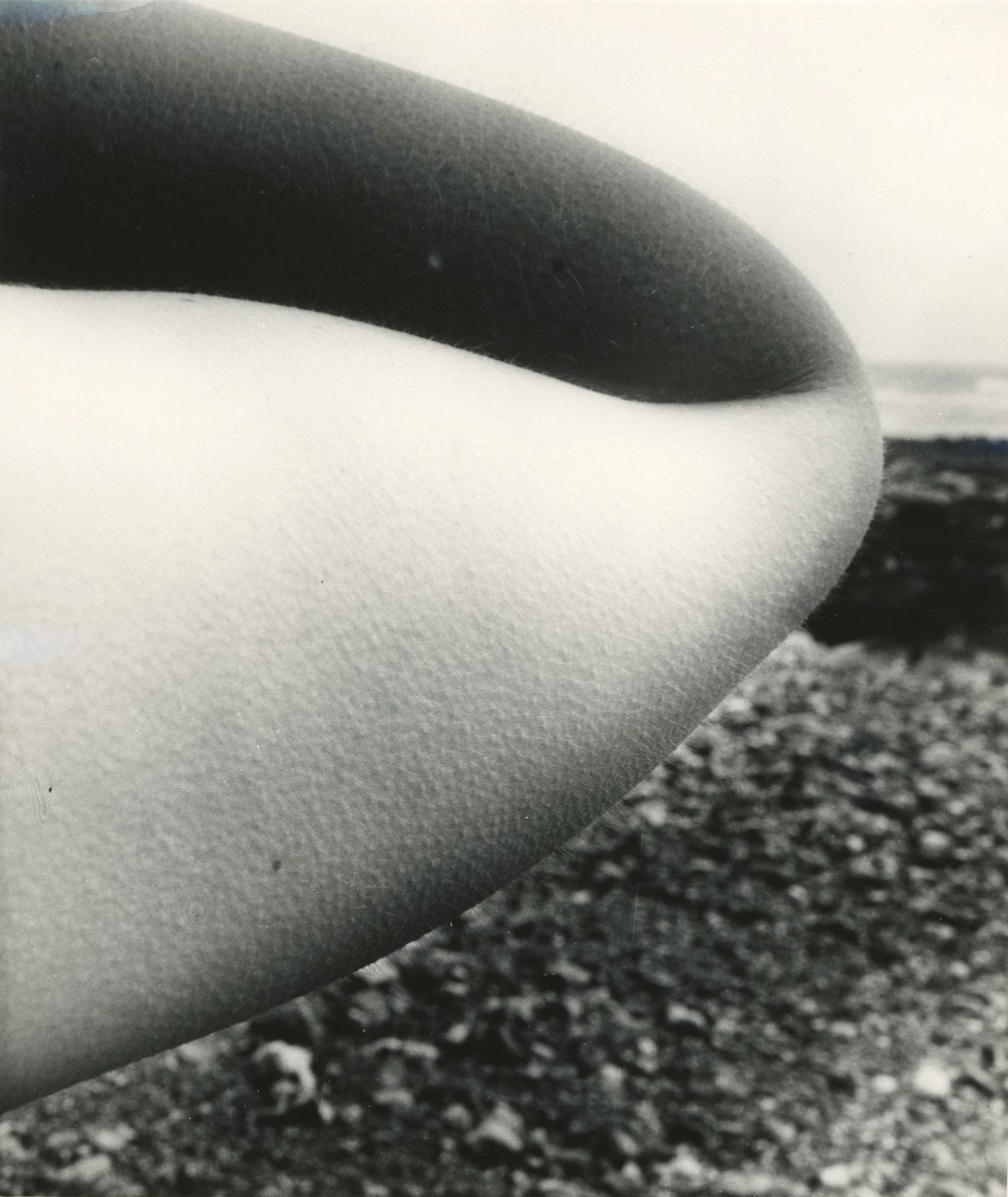
Bill BrandtBill Brandt was a famous photographer, known for his strong tonal and textural images.
His images are arguably sensory, as he often take close-range images of skin that show the texture and depth of skin. He was seen as one of the more abtract photographers from his time as he experimented with taking photos from unuusal angles that created a new perspective, an interesting composition that created bold images. All of his images are in black and white, although colour photography was used from 1861, 100 years before his time, colour photos were still very expensive so he could have possibly not had access to them, I can find any information specifically mentioning why he chose to shoot only in black and white. In 1945 Brandt bought a special Kodak camera in a second-hand camera shop in Covent Garden, London. The camera had been designed to enable untrained police staff to photograph crime scenes. It had a very wide-angle lens. Compared to the standard lens of the Rolleiflex camera Brandt had used for his documentary photographs, the Kodak allowed him, he wrote, to 'see like a mouse, a fish or a fly'. |
|
|
|
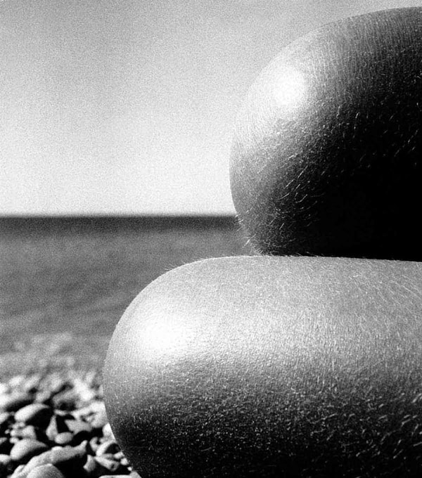
Robert HäusserRobert Häusser was a German photographer. Häusser's career as a photographer began in post-war Germany during his time working on a farm. Consequentially many of his first studies included farm landscapes and workers.
He has exhibited at more than 50 one-man-shows in museums and art galleries in Germany, France, Spain, the Netherlands, Russia, Slovenia and the USA. He received the Hasselblad Award in 1995. Similarly to Bill Brandt, Häusser didn't use colour photography as they were both photographers in the same time period, suggesting that most of the photographers of the 50s/60s didn't use colour photography due to its rarity and expense. However, I think Häusser's photographs work best in black in white anyway, as it brings the focus fully to the perspective, shapes and tones in the images, which from my research so far of minimalist photography, are the key features as they are what creates the sole appearance of the photos. |
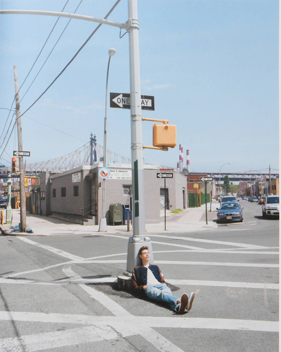
Cole SprouseCole Spouse, I know! Photographer isn't exactly the first thing that springs to mind.
But when deciding my topic for this project, I came across his photography and I love it; it perfectly combines my theme of minimalism with my passion for portraiture and fashion style photography. So although Cole Sprouse is not primarily famous for his photography, he is up and coming within the photography community; he has shot for several high status magazines/brands such as Vogue, Teen Vogue, The Sunday Times Style, W Magazine, Candy Magazine and Adidas. I am using him as one of my key photographer inspirations because I think his photos are thoroughly creative and perfectly reflect unexpected perspectives within portraiture. I also want to recreate some of his photos as I love the original ideas he has and think they are very forward thinking and futuristic, which is an interesting concept that I would like the explore in this project. |
|


|
|
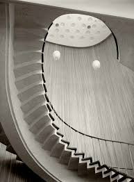
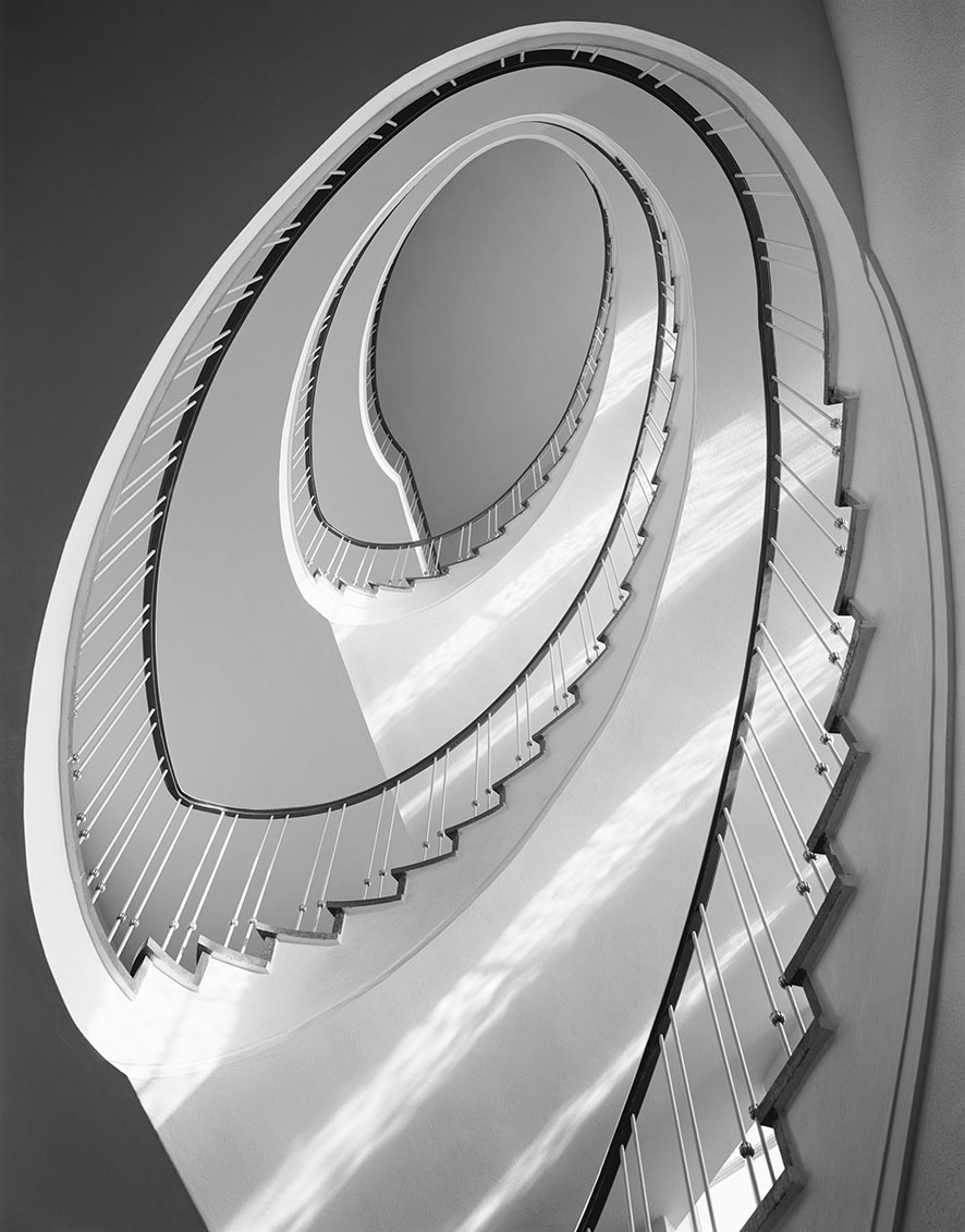
Karl Hugo SchmölzSchmölz was another architectural photographer of the 50s.
He was also a German photographer, like Robert Hussar and a more recent photographer Julian Schulz, who is one of my key photographer inspirations for this project. The prominence of German photographers, and photographers from the 50s/60s was not intentional and I only discovered this pattern when researching and writing up on each photographer. This prominence could be due to the trends of 50/60s photography and possibly a cultural trend among German photographers. However I think that all the photographers are different and have their own style of photography, despite the running theme of minimalistic architectural photographs. Schmölz focuses of leading lines within his photography, I want to try and take some photos in this style as I feel that creating shapes and lines to follow within an image is a really effective way to create interesting images and pushes the boundaries of perspectives within photography, which is essentially what my project is about; uses non-conventional perspectives to change the audience perspective . |
From these photographers, I have chosen 3 to carry through the project as my main photographer inspirations.
I have chosen to focus mainly on the works of John Batho, Cole Sprouse and Julian Schulze but this doesn't mean that I won't use the other photographers as inspiration, as I am inspired by all the photographers I have included above.
I have chosen to focus mainly on the works of John Batho, Cole Sprouse and Julian Schulze but this doesn't mean that I won't use the other photographers as inspiration, as I am inspired by all the photographers I have included above.
Shoot 1 - inspired by John Batho!
John Batho
John Batho is the son of a French mother and an English father, but he lives and works in France.
In 1961 he began his self-taught exploration of photography.
Towards the end of the 1960s, he took up colour photography definitively and developed a specific pictorial language.
By 1963, he had begun to develop his own unique approach toward colour photography. His photos of beach umbrellas, swimming pools, children’s rides, fairgrounds, amusement parks and oilcloth allowed him to explore various techniques, visual qualities and media.
In 1977 he was awarded the Kodak Photography Critics Prize. Numerous exhibitions and publications have ensued, giving him international acclaim.
Since 1979 John Batho has held many specialised clinics on colour photography; from 1983-1990 he taught in the Art Department of the University de Paris VIII, and from 1992 - 2001 he held a chair at the Ecole Nationale des Beaux Arts of Dijon.
His work has been shown in many prestigious exhibitions, including the Musée d'Art Moderne of Paris in 1977 and the Fratelli Alinari Museum in Florence in 1987.
As I’ve discovered previously from my photographer inspirations, colour photography was not very prominent in the 1960s, so the fact that Batho used it means that he would have been a stand out photographer of the time.
He used colour photography through something he discovered called the 'Fresson Process' - Théodore-Henri FRESSON showed the French Society of Photography "Photographic prints made on charcoal paper made without transfer", in 1899. T.H. FRESSON said that he managed to get this result by preparing his paper with several coats of different light-sensitive layers.The insoluble ones were close to the paper.
In 1960 with the help of young graphic artists and publicity photographers, the colour process started to find a market. In 1970 young artistic photographers such as John BATHO, Bernard PLOSSU, Bernard FAUCON found the possibility to use this process at it's best: i.e.Printing for exhibition and one-off prints, all helped by the excellent durability of preservation of the FRESSON prints.
"We must congratulate John Batho for having settled on the concentrated warmth, rich and dense velour of clean surfaces, matte and soft, of the Fresson process. John Batho's colour fields, thus brought to their richest expression, easily compensate for their lack of precision relative to reality that some nit-pickers might criticise." - Jean Dieuzaide (a french photographer).

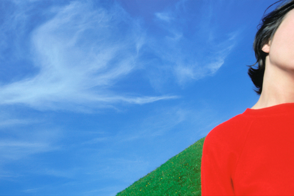
In-Depth Analysis:
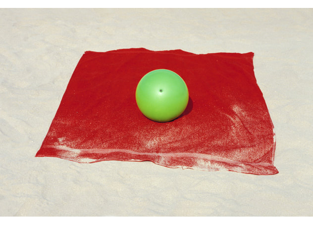
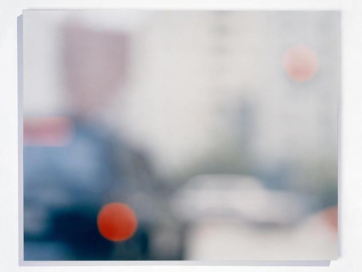
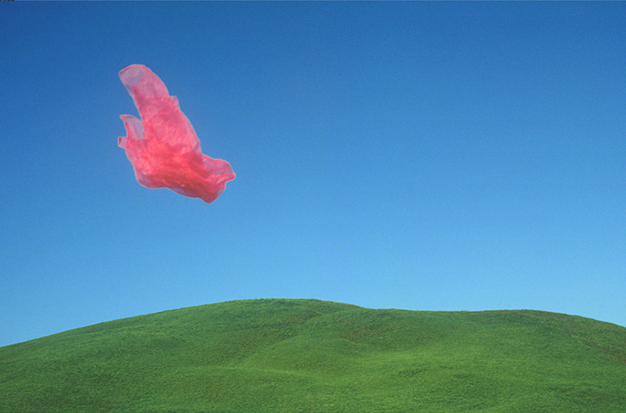
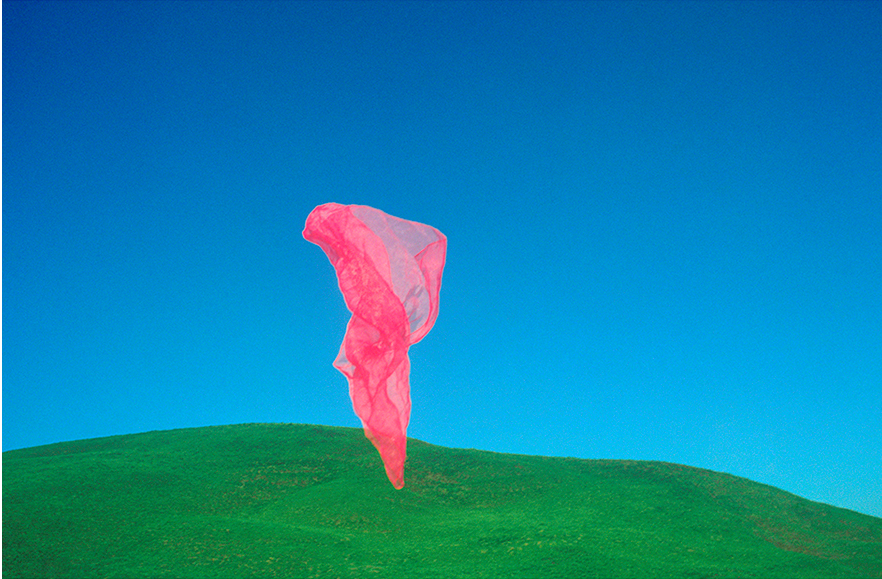
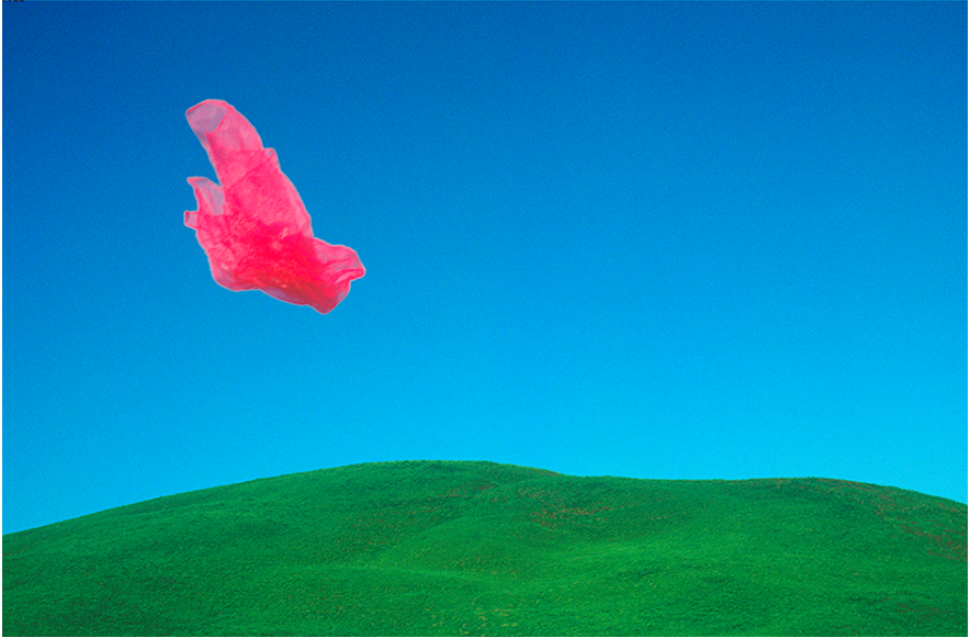
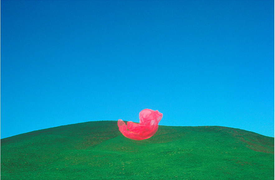
This image is ¼ of a series taken by John Batho. I have included this information as I think it's important because it can change the viewers perpective on this individual photo, because instead of being a stand alone image that presents motion frozen in time, as a series, it tells more of a story about the ups and downs of motion and how they can create frozen shapes in images.
From some more research of his website, I've now discovered that this is not the only photo series he has, he seems to create series of many of his photographs, I like this idea as I think that it gives each of his photos a story and this is something I want to try and create within my photography.
I couldn't find any direct contextual information online about the meaning or purpose of this image, but I do know it was taken around the mid 70s/80s. This means that It could have been part of several different art movements; Pop art - 1960s onwards, Minimalism - 1960s on wards or Post Modernism - 1971 onwards.
I included Pop art as a possible inspiration for this series as the simple composition with block colours perfectly reflects a work of photographic pop art!
I think that because Batho has a provided a great lack of contextual information for this image, that it's open to interpretation. The image consists of a simplistic scene of nature that almost seems disrupted by the aimless floating object, that appears to either be a plastic bag, or a thin cloth.
This could suggest an environment issue being presented, or could simply show how we as people disrupt the peaceful earth. This idea of the earth being peaceful is magnified by the natural cool tones in stark contrast to the hot red colour of the unnatural object, the variety in textures also accentuates the contrast between them and makes the floating object stand out even more.
Interestingly, even though this is a landscape, the photo seems to have more of a 2D form, creating a less realistic flat photo.
Despite the large area of negative space in the photograph, I think that it is purposeful and doesn't seem like empty space. The image appears very full due to the vibrant colours, textures and range of tone.
I think that this is very important within minimalism, as it can be easy to waste lots of negative space and leave it feeling pointless.
I think that because the photo has such a flat form appearance, it almost seems like surrealism and unlike most landscape photos, it DOES feel like everything to see is included in the image, it almost seems like the earth around the outside of the frame doesn't exist because of this. I think that this is an interesting concept and I want to try and create an image that gives off the same feel because it is something that I haven't come across before in photography.
In terms of technical elements, the lighting in the image is natural , and I feel that it was taken on a sunny day but soft sunlight, possibly in the shade, as there are no harsh shadows in the image.
The Shoot!
For this shoot I am going to take photos inspired by John Bathos’ colourful and minimalistic style. I plan to take a series of photos as I go about by week as I am travelling to Falmouth and Exeter meaning I should have some more interesting landscapes to work with! I am excited for this shoot and I think it will be a good kick-off to this project.
Contact Sheet and Editing:
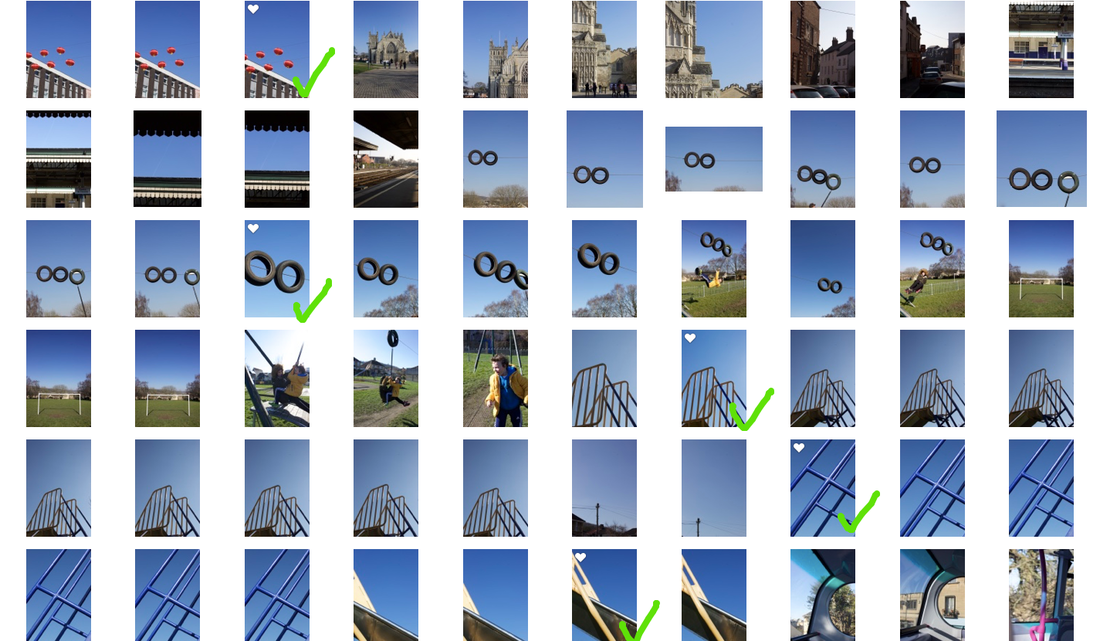
I have chosen 5 final images for this shoot as I feel that they best reflect the irregular perspective of minimalism.
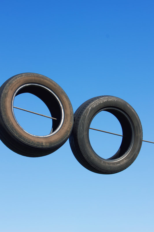
I took these photos over the period of a weekend travelling from Exeter to Bath, so I have used a few different locations to take these images, but they all work well colllectively as the sky remained blue all weekend!
I also like the mixture of nature and manmade I've created in all my images, and how the manmade shapes are complimented by the bright blue sky.
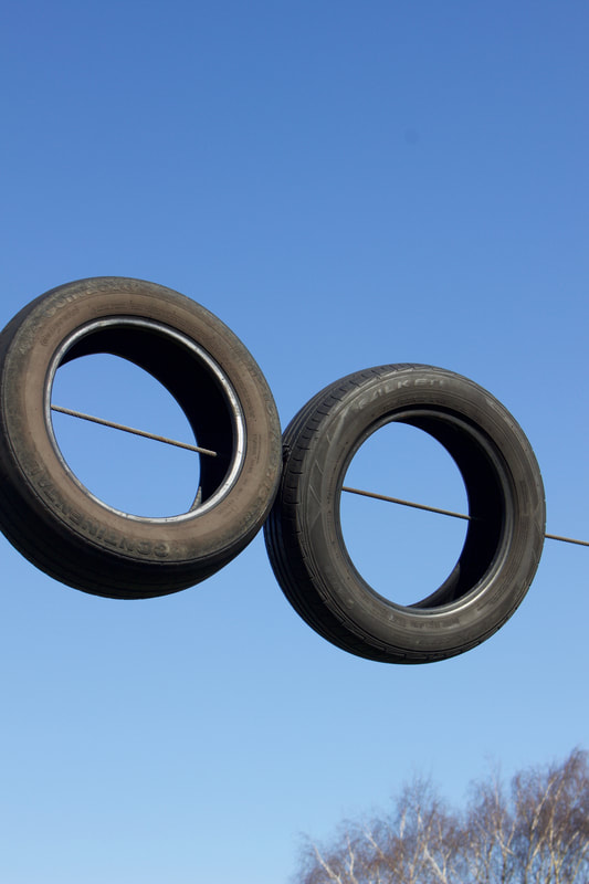

Here is an example of one of the edits I did for this shoot; The left photo is the original and the right is the edited, finished result.
I decided to remove the tree from the bottom corner of the original photograph as I didn't want to crop the photo and change the shape, (as all of the final images have the same crop and I wanted to keep them looking cohesive as a collection) but I wanted the photo to have a cleaner overall appearance and I feel that the tree disturbs this.
I used the editing feature on my mac photo library to remove the tree as I think it looks better without and it keeps the key focus on the tires, abiding by my minimalist theme.
I also boosted the saturation slightly and bent the tones to create a richer blue gradient.
I think that this simple edit is very effective and I love how the photo came out.
Final Images
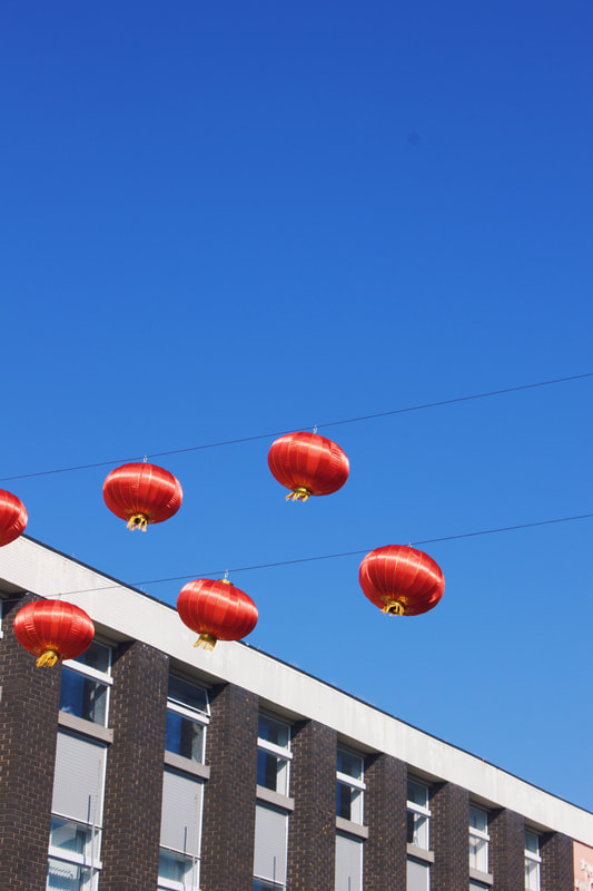
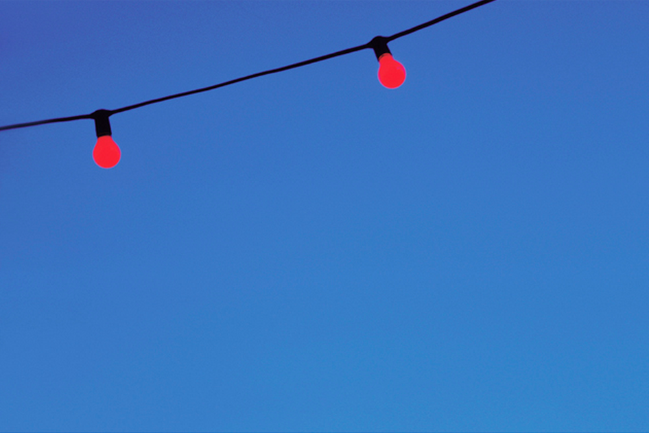
I am proud of these photos and feel like they are a great start to my project as they are exactly what I envisioned when setting out with the shoot idea in mind. Funnily enough, I didn't take any photos inspired directly by any works of Batho but when I was collecting images of Batho's after taking my photos I realised how he has a photograph of a blue sky with red lights and while in Exeter I captured a similar photograph that also contains a bright blue sky with red lanterns.
Final Image - Edited
(in the style of John Batho)
Shoot 2 - Inspired by Julian Schulze!
Julian Schulze
Julian Schulze is an up and coming minimalist photographer from Berlin, Germany. His photography focuses around the themes of geometric, abstraction and minimalistic.
Although he is not a greatly well known photographer, I wanted to include him as one of my key inspirations because I simply love his work, and of all the urban minimalist photographers, I think the composition and shapes in his images are more visually interesting than most. I believe this is because he creates a sense of almost surrealism through the interesting perspectives he uses, and as 'unexpected perspectives' is the focus of this project I feel that his work is highly relevant.
Also I feel that his work is a perfect representation of what minimalistic photography is to me - his photos are still powerful despite the calmness and simplicity of them.
He travels a lot for his photography in search of 'inspiring architecture', as he enjoys shooting colourful and interestingly constructed buildings as well as more simple ones. He shoots whatever architecture inspires his around Europe.
I also like his work because he doesn't try and make his photos extraordinary with what he photographs but he achieves it through how he takes the photos. He shoots a lot of buildings and street scenes which is nothing we haven't seen before, but he photographs them in a way that makes us perceive things differently and help us to find the art in the world around us.
This idea of finding art and beauty in the everyday is something which I've always thrived to do through my photography and as Julian Schulze does this so well I felt that I had to include him as one of my key photographer inspirations.
On his website Shulze talks about his photography methods along with photo examples in a series of blog posts.
One example of this is an article titled; 'About The Many Different Ways To Geometric Abstraction'
in which he discusses methods such as the 'interplay of colours', 'the composition of geometric shapes' and even the rotation of an image in order to create a more abstract and interesting perspective.
The link to his website is: https://www.julianschulze.com
In-Depth Analysis:
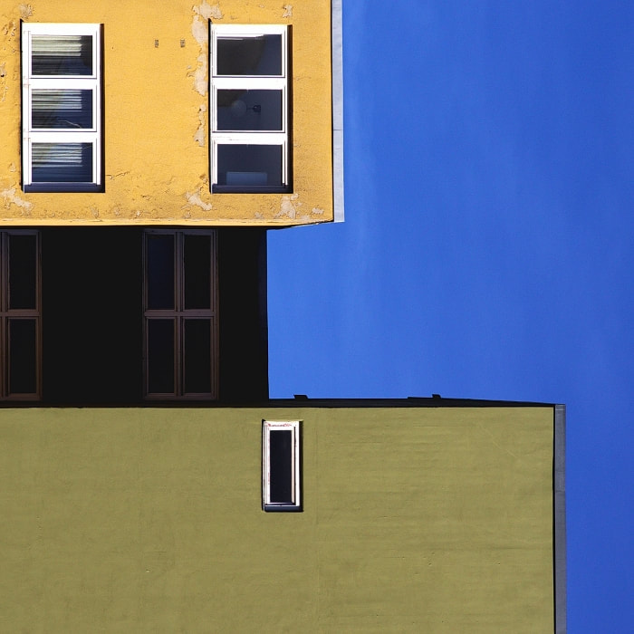
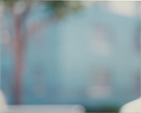
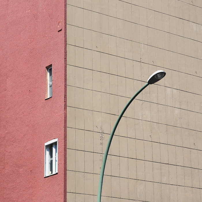
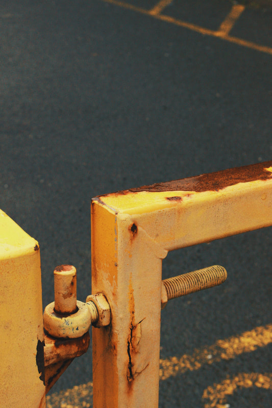
This photograph was taken in Berlin, Germany where Julian Schulze is based.
Schulze's method for photography is to take his camera with him everywhere he goes so he can capture anything that inspires him.
I believe that this is the best thing a photographer can do because you never know when inspiration will strike and you find something you want to photograph.
As far as contextual information about when this photo was taken I don't have a specific date but by looking at the photograph I can tell that it is a relatively modern building and by the lighting it is clear that it was taken on a bright sunny day with possibly a bit of cloud cover due to the lack of any harsh shadows from the sun. The only shadows are on the windows and these are not very significant within the photo.
As I've just mentioned the lighting in the photo is natural daylight. The levels within the photo are perfectly balanced considering the use of natural light can be tricky especially if there is harsh sunlight as this can distort the colours in the photo and create prominent shadows. The photo has a small tonal range which creates a series of complimentary pastel shaded colours that create a soft overall appearance, I think this works well with the minimalistic style of the photo as the tonal range is also minimal.
The camera settings used in this photo are unclear but I think that an ISO of around 400/800 was used as the lighting is well balanced but the photo also has a slight grain to it suggesting a higher sensitivity.
Visually the photo has more of a 2D effect because of the lack of tone variation but the lines in the photo help to bring back a more 3 dimensional effect. The crop of the photo allows room for imagination of what lies beyond the frame of the photo, which is also a feature of minimalistic photography as minimal photos are often created by using a tight crop to focus in one part of something instead of the whole thing, for example, this photograph shows a square section of a building and a lamppost instead of the entire buildings and anything else on the pavement along with the lamppost. The photo is rich in texture from the walls and I think that this brings more of an interesting element to the image as it keeps it within the realms of naturalism despite the surrealist perception of the photograph.
Although there is a lack of cool tones within the image I feel that the white balance is accurate as there is not a predominantly warm cast over the colours in the photos they are just naturally warmer toned colours that still reflect the blue of the sky. This mixture of the warm tones shot with with natural light means that the colours are perfectly balanced and captured as the eye would see them, this again supports the naturalistic element of the photo.
This images evokes a sense of easiness and freedom to me. I think this is because of the emptiness and simplicity of the photograph. The photo can tell a story of Schulze's day when taking this - he was having a stroll on a quiet spring day and came across this colourful building, he stood across the street from it, zoomed in and took the shot.
The Shoot!
For this shoot I am going out in search of colourful buildings/doors/signs!
I love how Schulze shoots buildings in such a simple yet fun way and for this shoot I aim to do the same thing.
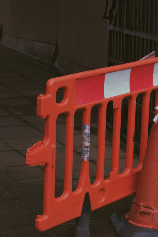
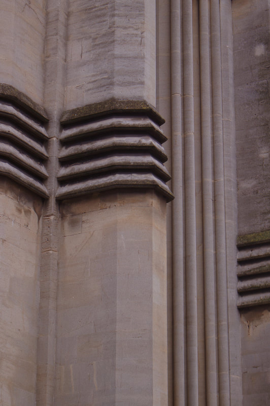
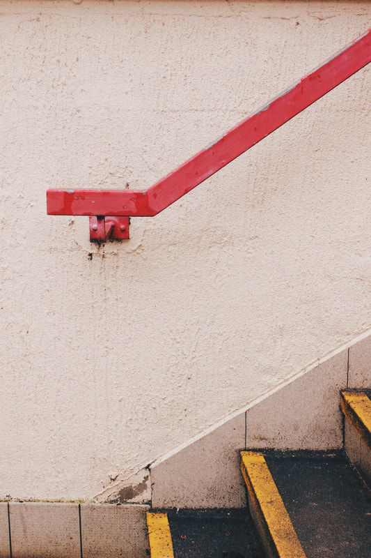
Post shoot update: I struggled to find colourful buildings but I did find lots of colourful street 'things' such as cones, gates, doors, hand rails etc that were all colourful so I did best I could with what I had and I am pretty impressed that I still managed to shoot in a similar style to Schulze which I thought I would struggle with.
I think this shoot was tricky, but overall pretty successful!
I love how Schulze shoots buildings in such a simple yet fun way and for this shoot I aim to do the same thing.
Post shoot update: I struggled to find colourful buildings but I did find lots of colourful street 'things' such as cones, gates, doors, hand rails etc that were all colourful so I did best I could with what I had and I am pretty impressed that I still managed to shoot in a similar style to Schulze which I thought I would struggle with.
I think this shoot was tricky, but overall pretty successful!
Contact Sheet and Editing:
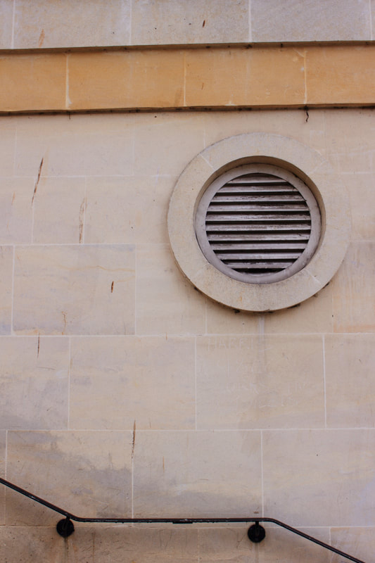
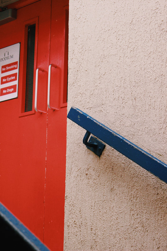
I have chosen 7 final images. Although this is an odd number, I wanted to include them all as I am proud of them and like how they work well together. Each photo is different but has similaries and all follow the same minimal theme.
I think this is a good principal to stand by when selecting final images from a shoot, because although it can be aesthetically nicer to have an even and consistent amount of final images, I don't think this should overrule the decision when selecting final images.
These are my final images, no rhyme or reason necessary.
Original Edited
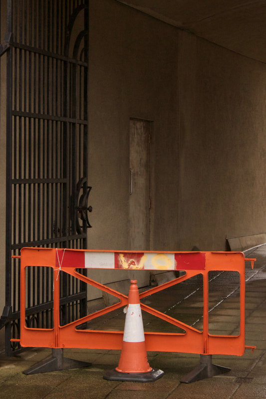
Here is an example of one of the edits I did. I used a photo editing application on my mac called 'PhotoScape X' to create this edit. I wanted to darken the photo and also bring some cooler tones to it so by adjusting the white balance and decreasing brightness I did this. I also did smaller adjustments such as a colour enhancement of the red/pink tones in the photo and the addition of a slight grain effect on the photo. As for the main adjustments of tone and exposure I applied these to all the final images but with the smaller adjustments I did according to the specific photograph in order to enhance the photos and add a reasonable amount of grain to give the photos a slight texture. I like this look and I found by looking that Julian Schulze's photos, he also either shoots with textured walls or adds a slight grain to his images to create more a textured image, so I felt it was an appropriate edit for this shoot as it is inspired by his work.
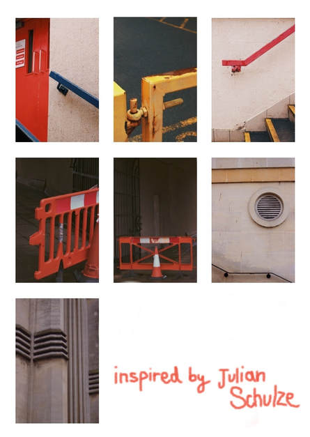
I have created this college of my 7 final images as this is something that Schulze does with a lot of his work, especially on his Instagram, when he is trying to show a group of photos from a specific location or with the same running theme, for example, he does a lot of collage style photos like this to show a group of geometrically similar images.
I think that it is a nice way to present a collection of photos and show how they work well together as a visual collective.
I have included it as a preview to my final image as I wanted to still have my stand alone final images, but I also wanted to show how they looked together, as they all follow the theme of primary colours within the urban landscape.
I think that through this collective image, the themes within this shoot as clearly presented and the use of minimalistic framing and primary colours really accentuates the shapes and leading lines in the images.
Here is the link to Julian Schulze's instagram:
https://www.instagram.com/einsilbig/
Final Images


Schulze's Work vs. My Response

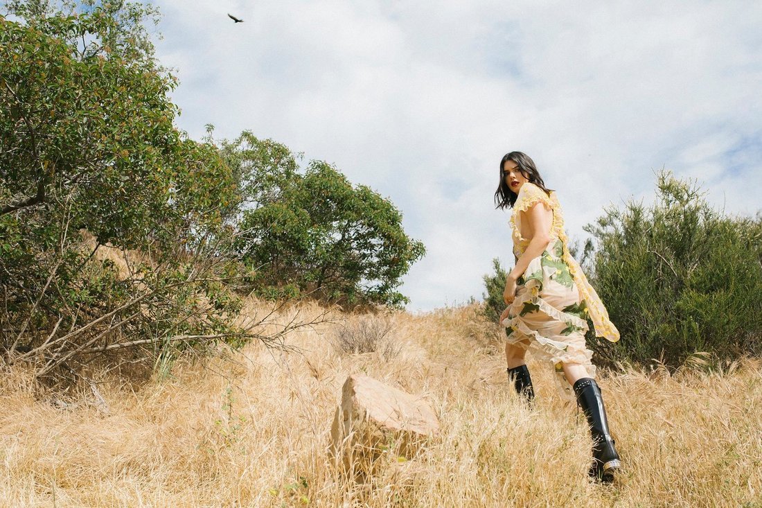
Shoot 3 - Inspired by Cole Sprouse!
Cole Sprouse
Although Cole Sprouse's photography is not directly labeled as 'minimalistic' the individual style of his photographs do fall under the visual style of minimalism. Because of this he is different to other minimalist photographers as his photos dont have the same almost 2 dimensional/ flat effect of the others, as his response to minimalism is more about the focal point of his images. How he has a key focus of each image that the eyes are drawn to and doesn't get models to wear fancy clothes or to create fancy shapes but instead uses natural shapes and minimal styling to create beautifully minimal photographs.
Cole Sprouse's newfound talent for photography is rapidly being recognised by big fashion brands such as Vogue and Adidas. He is becoming part of the fashion photography community with his personal style of fashion portraiture that heavily involves nature scenery and interesting perspectives that create a visual effect of minimalism.
In several interviews with Teen Vogue and other sources, Sprouse has discussed how photography is something that has helped him curb his depression. Below I have included a video interview where he talks about his photography and what it means to him.
In this interview Sprouse discusses his methodology as a photographer and his belief in the idea that photography shouldn't be a competition of who has the most expensive camera and takes the highest quality photos as these people are often not the best photographers. The best photographers are people who take photographs that provoke a response. Photos that make people feel something.
He also discusses how he likes to look at the paid works of photographers; the photos that photographs have taken for a brand/magazine etc as these photos show how the photographer works under pressure instead of the freedom of taking photos leisurely. I think this is an interesting idea as I would say that the photos taken with complete freedom are a better representation of the photographs style and brand but this is a good way of testing the diversity and skill of a photographer.
In the video, he also says how he does not condone nude photography as at this point in time, it is unoriginal and the sheer level of sexual exploitation linked to this type of photography is something that needs to stop. This links to my component 1 project and the issues around the Mario Testino allegations. I like how by having Sprouse as a main inspiration for this project it almost shows a growth from the previous project as I am inspired by someone who is against the wrongdoings of a photographer in my previous project.

In-Depth Analysis:
This photo was published to @colesprouse Instagram account on the 2nd of June, 2016.
It is also featured on the LGA website - Sprouse's management company, along with a full portfolio of his work.
Sprouse does not have a website of his own, only his Instagram page, which is arguably the millennials equivalent.
Despite this modernist idea, Sprouse captions all his photographs with almost lyrical words that seem to be threaded with nostalgia of old times where the english language was used to it's greatest capacity, instead of the modern abbreviated and shortened version people commonly use.
His caption for this photograph is; "Watch for things that linger in those golden grasses. Nothing wants to fade into memory, and even the seeds wish to stay with you for a little while longer. You'll find them in your shoes, sleeves, and stockings: little forget-me-nots. Just don't forget they had to pierce you in order to hang on."
This use of poetic language adds depth to the perception of the image and helps to support the way the viewer interprets the photograph. I think that the use of captions can be a good and bad thing depending on the photographers intent; sometimes they can support a photograph and bring a greater sense of meaning to it, while other times I think photos should be able to speak for themselves and stand alone without any words to guide how they are digested by the viewer.
This photograph is taken in natural lighting and it appears to be a bright, sunny natural light due to vibrant colours of the corn and the models glowing skin. I believe that the photo was taken was a small to regular aperture of around 10-12 due to depth of field - the foreground and mid-ground containing the model are in focus while the background is blurred. This creates a depth of field that is unusual within what I've observed of minimalist photography, as most of it seems to have the whole photo in full focus to creating a more 2 dimensional effect, whereas this image has a 3 dimensional appearance. However I think this depth of field works well for this photo as it draws the focus to the simplistic shape of the model.
This photo has a warm overall tone to it, due to the prominence of yellow within the photo, but it still seems to be balanced as the models hair and skin tone don't look overly warm.
The use of black on the model's jumper widens the tonal range of the photo, creating more of a contrast between the model and the scene around her, further drawing attention to her as the focal point of the image.
The corn creates a rich sense of texture within the photo and gives it a strong sense of life that makes what could be described a simple image, much more complex and visually engaging.
The middle is positioned slightly off the centre of the photo and this imperfect positions adds character to the photograph as it a visual decision the photographer has made in order to achieve something, but what? This allows the viewer to wonder, meaning that the image is effective as a piece of art, because it provokes thought/feeling which is a powerful feature for a photograph to have.
I interpret the photo as an imperfect reality. The imperfect reality of our lives, the slightly off centre positioning of the model and the laid back, minimal styling creates a carefree, naturalistic feel to the photo. What I love about this image along with the rest of Sprouse's work is the realness it exerts. His photos feel real and natural, not forced and superficial like a lot of fashion photographers work.
I think this reflects his laid back and raw personality which is powerful because you can recognise his work by looking at it, because it represents him as a photographer and a person. This is arguably part of the reason for his rapid success and acceptance into the world of photography; because he is a public figure, people know him and this means that more people can recognise that his photography reflects him as a person, which is a truly powerful skill for a photographer to have.
The Shoot!
|
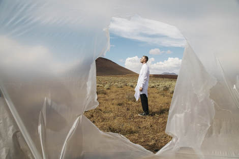
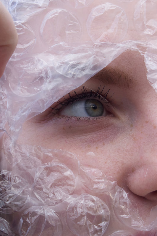
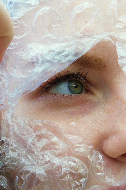
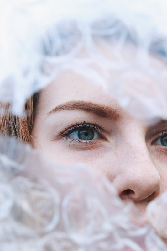
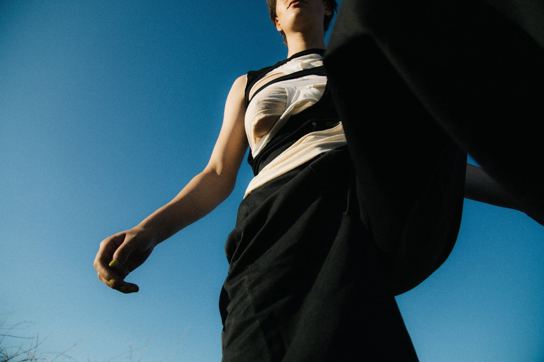
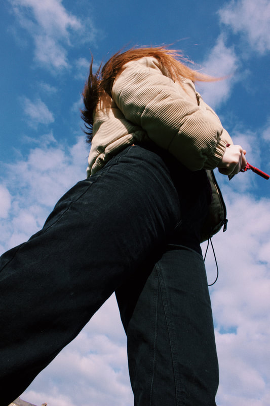
When planning this shoot I didn't have a set concept in mind, I just knew that I wanted to shoot outside, preferably on a day of clear blue skies. I had one specific photograph of his that I wanted to test out ideas from; a photograph he had taken of sam smith through a cutout sheet of plastic. I loved his different this idea was to anything I'd ever seen in photography before. I like how it plays well into the concept on unexpected perspectives and in the photograph we are only shown a fraction of landscape while the rest is covered by a sheet of plastic. By using something so dull and manmade, it emphasises the beauty of the nature behind it which is what I interpret Sprouse was aiming to achieve with this image.
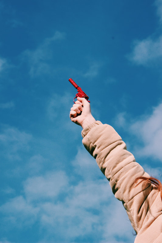
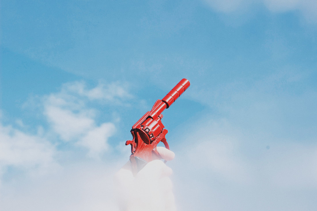
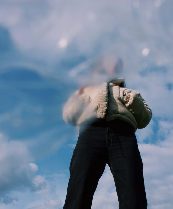
I wanted to do something similar to this but use a sheet of something with more texture, I decided to use bubble wrap as this adds a richer and more interesting texture to the photo. As for the rest of the shoot I just asked my model to wear anything she wanted, what she wears daily, no special styling as this is not what Sprouse believes in. I also toyed with the idea of creating a sort of storyline through my photos and thats where the idea of the red toy gun came in. I was thinking what sort of prop I could use that wouldn't seem totally unnatural with the models casual dress and decided on the gun. Coincidently, the cream puffa jacket my model chose to wear went quite nicely with the gun and with the mix of her clothing and the nature scene in the background I feel that the shoot took on a story of a cowgirl. I was happy with how naturally this story came into play and seemed to fit well with Sprouse's photography as I feel that some of his photos are almost cinematic and my photos started to attach to this theme also. |
|
Contact sheet and Editing:
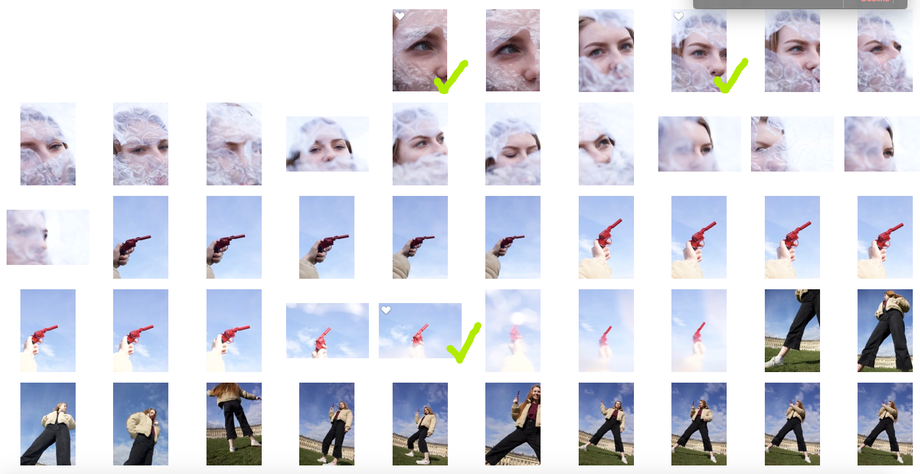
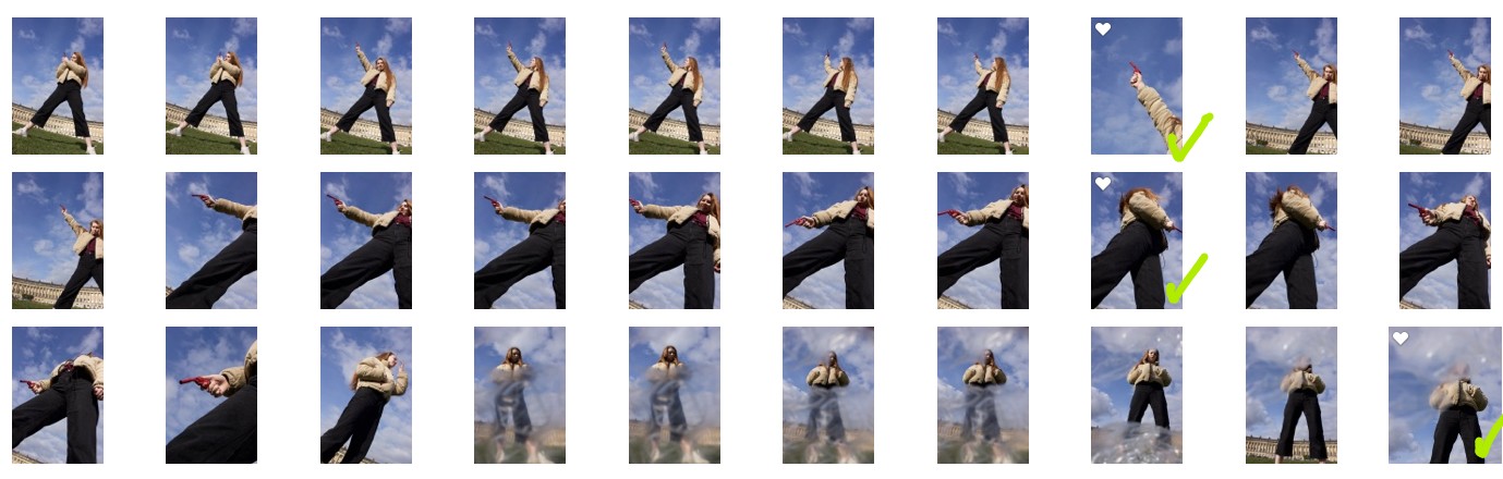
I have chosen 6 final images as I feel that they all work well together as a series and together carry the cowgirl storyline that formed during the taking of the images. As you can see from the contact sheet I explored shooting from many different angles and decided that shooting from below created interesting linear shapes that work well within both the style of minimalism and unexpected perspectives.
Original Edited

Here is an example of how I edited one of the photos; I fixed the white balance as the original photo has a purple/pink cast over it. I added a slight grain as I like the visual effect of this, and many of Sprouse's photos have a grainy effect to them. I also increased the saturation and the sharpness in order to make the eye pop and have more of a prominent appearance in the photo as it is the focal point, and in the original photo, seemed to be lacking that eye-catching element. I am happy with how this edit turned out and I think these simple adjustments made a big change to the image without making it look heavily edited.
Final Images

I am happy with how this shoot went, I think I successfully took photos that are visibly inspired by the work of Cole Sprouse and almost still follow the theme of minimalism within unexpected perspectives. If I could change one thing about this shoot is I would have shot on a day where the sky was fully clear - I did try to do this but as the weather has been pretty awful recently (snow in march!) I decided to settle for a day where it was sunny but cloudy. Despite this, in the photo below I have grown to appreciate the addition of clouds and I think it works well with the photo, although a clear sky may have worked even better.
Sprouse's Work Vs. My Response
What I've learnt from my photographer inspired shoots...
From doing these three shoots inspired by the works of John Batho, Julian Schulze and Cole Sprouse I've discovered how different photographers play with the idea of perspective and how it can be manipulated through photography.
I have also discovered the different representations of 'minimalism' and how some styles are more visual while others are perceptive and symbolic.
These photographers individually have all made me think about the angles I use when taking photographs and how I can challenge the 'norm' to create a more interesting image.
I love all of their work and I'm happy that I got to do a shoot based on each one of them as they are all so different but all share the theme of unexpected perspectives that involve an element of minimalism - whether it's conceptional or visual minimalism, For example; Sprouse's photos are not as visually minimalistic as the other two but the photos still hold a feel of isolation and the minimal styling he uses on his models creates a feeling of simplicity which is a key part of minimalism.
Shoot 4
For this shoot I took a trip to 'West Midlands Safari Park' for the day! I decided that I wanted to explore a type of portraiture I'd never ventured into before; animal photography! In order to help this exploration fit into my project I had to think fast about composition and perspective while trying to freeze any movement the animals made.
Unlike shooting people, it's a lot harder to get an animal to stay still while you take a photo, my tactics to achieve this were buying the overpriced food at the entrance and getting my brother to feed it to the animals to encourage them to come closer and remain still for a moment. I also had to use a fast shutter speed in order to capture the split second of stillness that I was working with.
I took a series of photos of each animal that came near, so overall I took lots of pictures that can be spread out across a few shoots, so I think I will use this big shoot as a mini series within my project. As I took so many pictures that I want to include, but don't want to cram them all into one shoot.
Contact sheet and Editing...
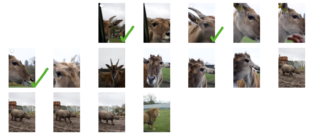
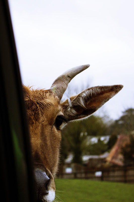
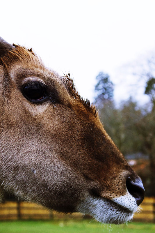
I have chosen 3 final images of the 'Eland Antelope'. I like these photos because they all show the same animal but from different perspectives, and each one is has a feeling of simplicity and minimalism.
I was surprised when looking at my images, before choosing my final images, that I had managed to take photos that have areas of negative space, as I had to capture whatever I could, in a quick-paced series of clicks as the Antelope was constantly moving.
I am proud of these photos and the visual minimalism they hold, especially as they were taken quickly, meaning I had very limited time to think about composition and framing.
This is something that I had never experienced within photography before, and so I am pleased with my outcome for a first time attempt of shooting animals.
I would like to shoot more animal portraiture in the project if I get a chance as I feel it has a much more impactful visual effect than human portraiture, because of the rich textures that human skin lacks.
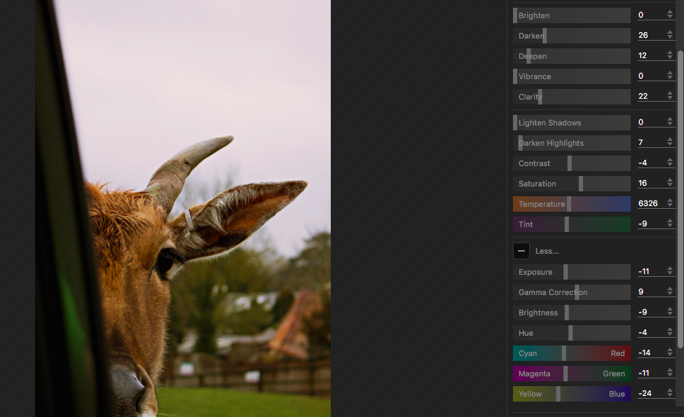
Here is an example of my editing process on these photos, I edited them all the same way in order to create a cohesive series. I used the editing software; 'PhotoScape X' on my mac to create the final images.
The main changes I made to the raw images was an increase in saturation and contrast; this helped the photos to pop more and stand out against the white sky. I also edited the tones to create more red and yellow tones instead of green and purple tones. I didn't want to make the photos too warm though, so I did slightly enhance the natural blues in the photos also.
I didn't want to completely change the photos to a point of no recognition so I focused on enhancing the colours and tones that were already in the image instead of overlaying filters.
Below I have included a before and after of one of the final images. I included this to show how my editing process is used as a tool of enhancement instead of change. As I believe that heavily altered photos are not as truthful to the photographer - as it is showing more editing skill rather than photographic skill.
Original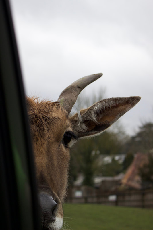
|
Edited
|
Final Images

Shoot 5
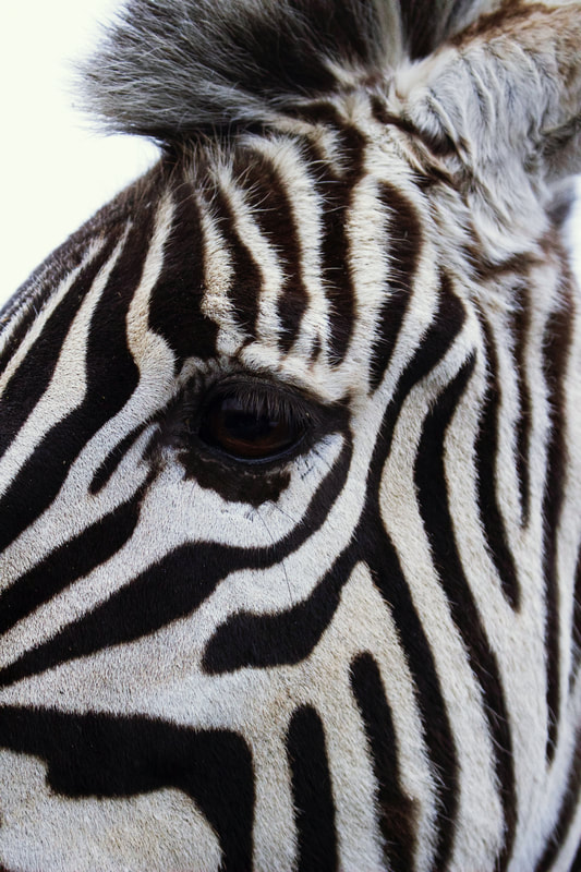
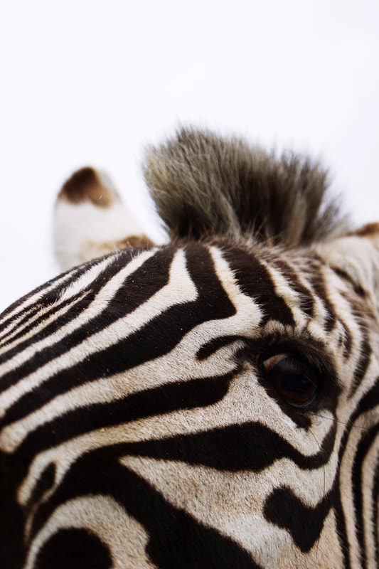
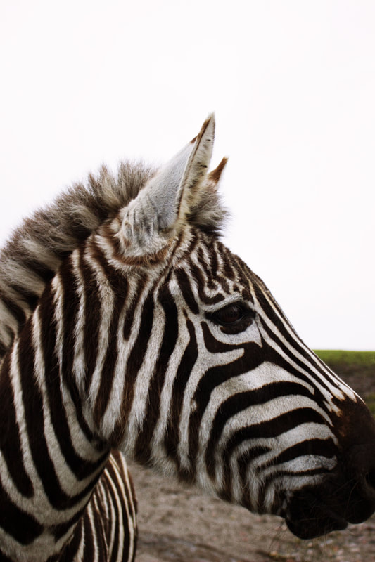
As I mentioned in the previous shoot, this shoot is a continuation of shoot 4 as I wanted to divide the shoots by animal as the process of shooting each animal was different. I took pictures of several animals but I decided to only include my two favourite series of photos; so I chose the Antelope for shoot 4 and for this shoot, the Zebra! I chose the Zebra as I love the intricate design of their skin and I am happy with how well they photographed; Zebras are very photogenic! This is because of their striking patterned skin and bold black and white stripes.
The Zebra's, although not as fast moving as the Antelope, did still make my job difficult by constantly moving around. In order to combat this I had my camera ready at all times with the appropriate settings; I used a fast shutter speed of around 200 and kept my aperture around 15 in order to maintain the good level of exposure I had pre-set for the dull daylight that day. The exposure was probably the hardest thing to manage, as the high shutter speed throws off the lighting - as the quicker the click, the less light is let into the camera. I think that my ISO was set to 800-1200, because although the sky was bright and white, it wasn't sunny at all and the fast-shutter speed meant that I had to make a considerable change to the exposure in order to come out with correctly exposed images. I believe that from my contact sheet it is clear that I successfully set the exposure - as none of the photos are over or under exposed.
The Zebra's, although not as fast moving as the Antelope, did still make my job difficult by constantly moving around. In order to combat this I had my camera ready at all times with the appropriate settings; I used a fast shutter speed of around 200 and kept my aperture around 15 in order to maintain the good level of exposure I had pre-set for the dull daylight that day. The exposure was probably the hardest thing to manage, as the high shutter speed throws off the lighting - as the quicker the click, the less light is let into the camera. I think that my ISO was set to 800-1200, because although the sky was bright and white, it wasn't sunny at all and the fast-shutter speed meant that I had to make a considerable change to the exposure in order to come out with correctly exposed images. I believe that from my contact sheet it is clear that I successfully set the exposure - as none of the photos are over or under exposed.
Contact sheet and editing...
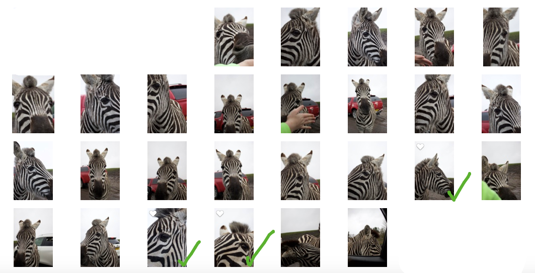
As you can see from my contact sheet, my favourite photos; the ones I selected as my final images, were taken towards the end of this shoot. This is because at first, I was adjusting to the new shooting scenario of moving animals and as a result of this, the first few pictures were taken purely as practise and didn't have any successful visual impact whatsoever.
However, once I got into the groove of shooting with the Zebra's I managed to take some good photographs that explore different perspectives and forms of minimalism. For example, from the 3 photos I've chosen, none of them are the same in composition and none of them have the same level of negative space.
I have chosen 3 final images, as I did in the previous shoot. I have chosen photos that all show different perspectives of the Zebra, but all still follow the theme of minimalism through the visual shapes and compositions of the images. I tried to choose photos that don't have a busy background, but are also high quality up-close shots that really show the beauty of the Zebra's design. I think that the 3 images I have chosen, present 3 different perspectives that are all visually impactful and aesthetically interesting. I think the effect of patterns such as Zebra print is highly effective within minimalistic photography and it is something I would like to explore further in the project, whether thats through the use of patterned fabric, or further animal photography...we shall see!
Original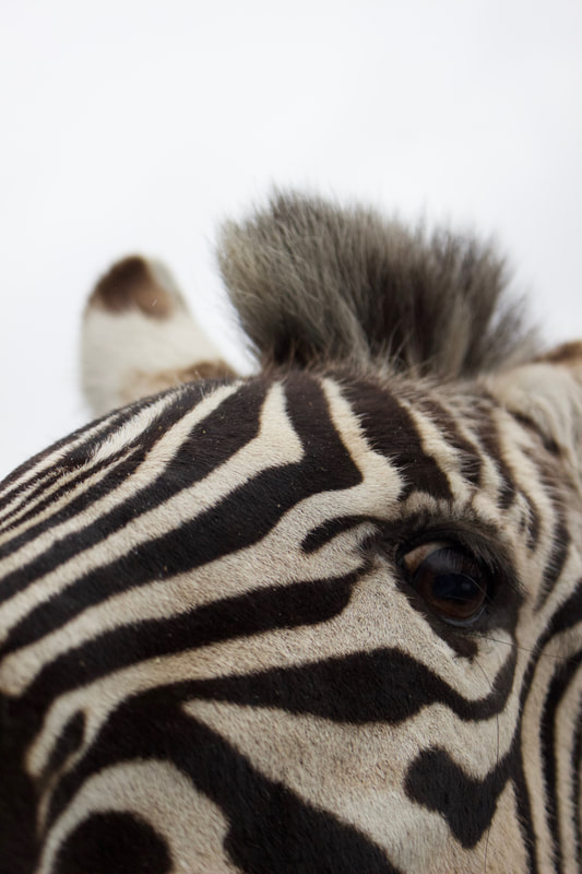
|
Edited
|
Above I have included a before and after comparison to show the effect of my editing process. I used the same software (PhotoScape X) and edits as I did in the previous shoot as they were shot in the same lighting and setting circumstances - although the Zebra's didn't move as much as the Antelope did, meaning I could use a slightly slower shutter speed and still capture successful photos with no sign of motion blur.
As you can see from the comparison, I didn't alter any of the original colours in the photos, I just simply enhanced them to make the dark tones deeper and the light tones lighter to create a higher contrast, in order to give the Zebra's print a stronger visual appearance.
I also lightened the sky in order to make a clear white, cleaner looking image and the original was a slight off-white grey which I wanted to correct to make a simpler overall view.
I am happy with how the final images came out, as I think they have a bold and eye-catching visual effect and work well together.
The close-up focus on the eye also engages the viewer and brings life to the animal behind the eye.
Overall my exploration of animal photography has been very successful in my opinion and I feel that I have learnt a lot from it about how one thing can be presented in a number of different ways with the use of angles and photo composition.
Final Images
Shoot 6
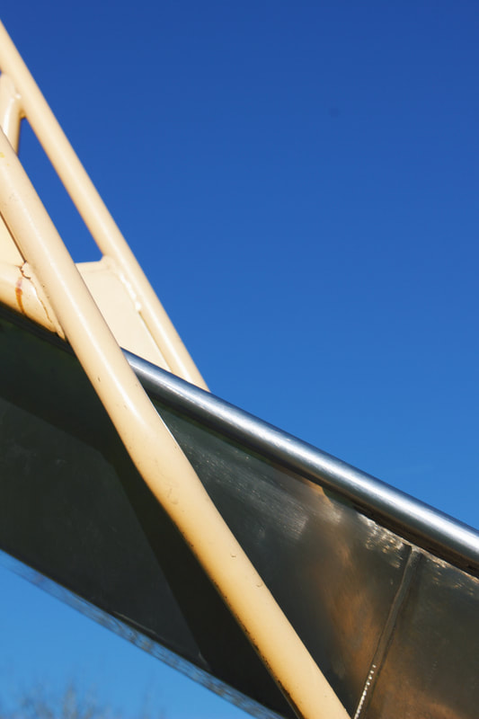
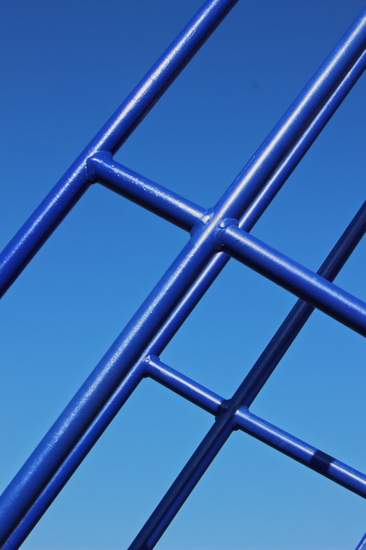
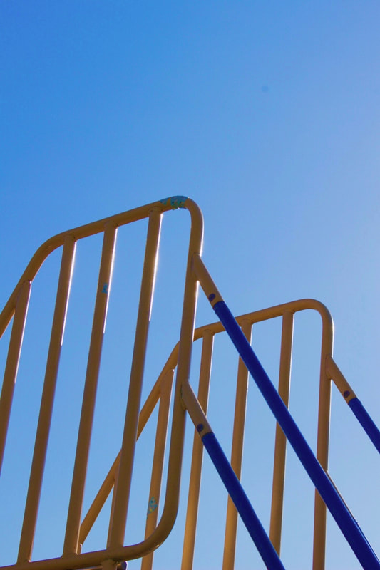
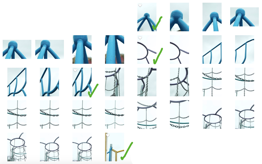
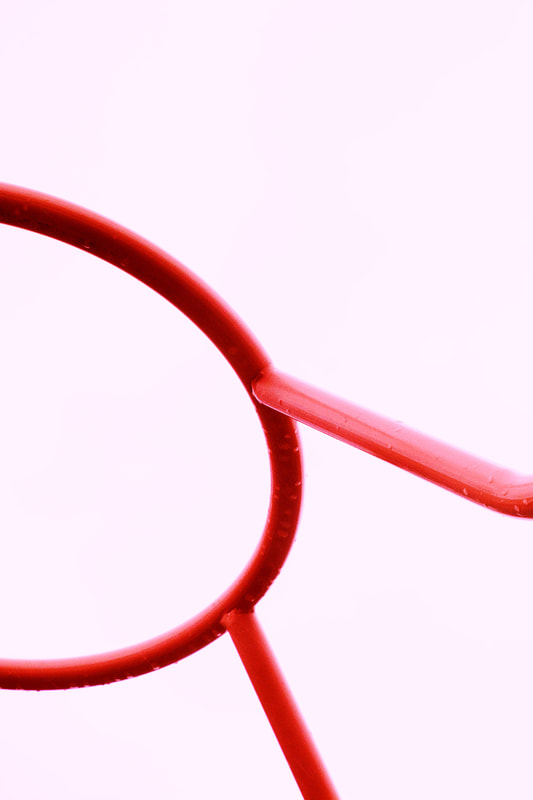
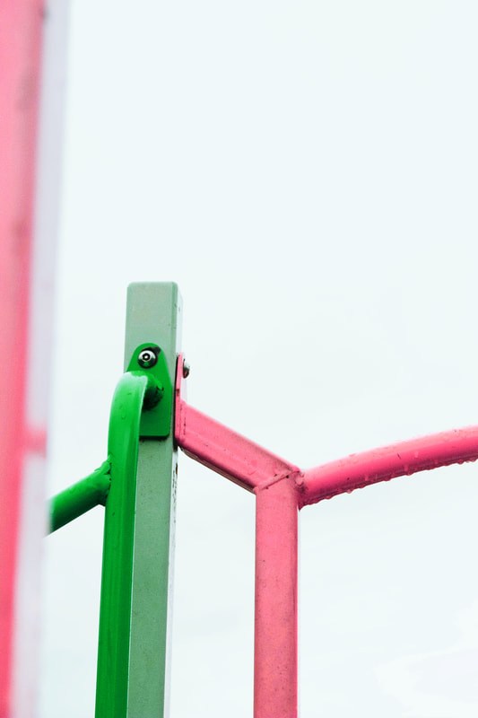
For this shoot I decided to focus on architectural minimalism. I went to a park where there were many coloured metal structures and shot them with the bright contrast of the white sky.
I wanted my photos for this shoot to have a simplistic visual effect, with the focus on the linear architecture. I think that I have successfully achieved this.
I did originally intend to shoot with a blue sky as a background, as this has worked well in previous shoots. Despite this, I think the lines stand out more against a white background. The colourless background also emphasises the colours of the architecture in the photographs, which is something that I feel works well visually as the simplistic style of the photos can sometimes create a lack attention but the bright colours help to create more interesting and engaging images. The minimalistic layout of the images also helps with the following of the leading lines.
So visually, the compromise of using a white sky and shooting objects that were covered in raindrops ended up being an advantage instead of a disadvantage.
I think the rain drops especially added a sense of dimension to the photos, as the linear style of the photos could seem flat, but the impact of the raindrops adds a subtle texture that helps to bring dimension to the images.
I also wanted to take photos that are consciously unexpected perspectives. I wanted to take simple things like - playing equipment in a park and turn them into something unrecognisable.
This is also part of my philosophy of photography; taking thinks from everyday life and showing the beauty in them - in order to provoke a new found appreciation for the world around us and the beauty it holds.
This idea also works well with unexpected perspectives as it trains the eye to look at things from a different angle and accept that everything can be beautiful, it just depends how you look at it.
By doing a project on unexpected perspectives, and within that minimalism, my eye has been trained into finding things and presenting them in a totally different way.
This perceptive concept of beauty from perspective is something that really interests me and is that is why I chose to do this project in the first place.
Contact sheet and editing...
I chose 4 final images as they all had a different linear perspective, while still working well as a collective.
As you can see from the final images, I altered the colours of some of the architecture in order to create a wider variety of tones and more interesting images.
In terms of the technical method of taking these photos, I used the following setting the capture the images of this shoot:
- ISO 400/800 - as the sky was bright white, but overcast with clouds.
- Aperture 12-15 - so the full image would be crisp and in focus, without any distortion of depth of field.
- White balance - set to cloudy - as this matches the sky and wanted to create white images.
- Shutter Speed 50-100 - regular/slowish as wanted to ensure sky would be clear white without any grey cast.
Original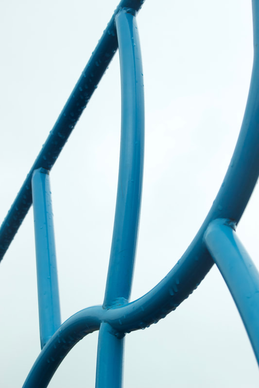
|
Edited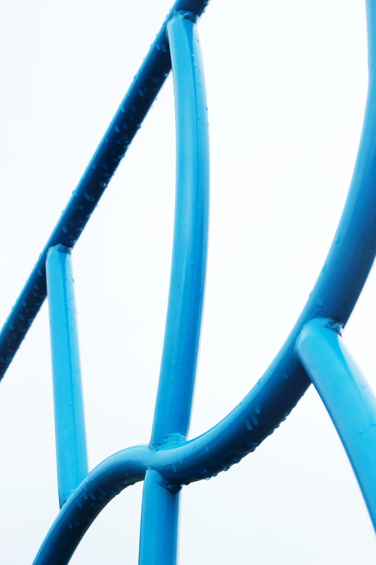
|
Here is an example of one of the photos; before and after editing.
I have included this to show how my editing was simply a method of enhancement, as I try to make it throughout all of my photography, because I disagree with heavily edited photos as I don't believe they are true to the photographer if they stray too far from the original.
In this photo I have brightened the background slightly, as the original is off white with a slightly blue tinge and I wanted to make the image look as clean as possible.
I've also increased the contrast slightly to bring out the shadows and increased the saturation to make the blue more vibrant.
I call this edit 'simple but effective'.
Overall I am happy with my final images but I feel that they lack the strong visual impact that I hoped for. Also when editing, I wasn't able to fix the white balance in all the photos, meaning that they don't match up and I think this detracts from the collective coherency that I strive for in all my final images.
Final Images

Shoot 7
For this shoot I was inspired by nature and the linear aesthetic within it.
I wanted to create a shoot that explores the concept of leading lines and how our eyes naturally search for lines to guide us when looking at photographs.
I also wanted to take photos that reflect the spring-time with the turning of the leaves and new life.
I am aware that the end of this project is closely approaching and I wanted to do a nature shoot, as my plan for my final shoot is portraiture within nature.
I want to combine my love for nature and minimalistic aesthetic, with my previous exploration of fashion style portraiture; as this is my personal style of photography and what I enjoy shooting/directing most.
I appreciate the freedom I have within the theme of unexpected perspectives - minimalism, because it allows me to create photos that are personal to me but also have a recurring visual effect of simplicity.
I connect a lot with this idea of simplicity, especially within photography because I feel like often people feel more is more in photography and the more magnificent and detailed a photograph is, the better.
However I disagree with this because I think simpler photos can be much more impactful and keep the focus on what's important instead of giving the viewer too many things to look at.
I live by the idea that photography can be a way to express the world in a way that makes people appreciate it more and I feel that through the use of unexpected perspectives and minimalism it can help people to see things a different way and to appreciate the simpler things in life that are often overlooked.
That is why I have captured scenes in the shoot that I see on a daily basis as they are taken outside my house - in an attempt to not only aid the viewers appreciate of the world but also my own as I think we too often take for granted the amazing world we live and are too quick to nit pick and single out the imperfections.
Contact sheet and editing...
From my contact sheets you can see that I took a wide range of photos for this shoot, and I have noticed a pattern that when I am shooting nature scenes I often take a lot more images than usual - I think this is because when looking into nature through a more conditioned eyed -searching for beauty - I notice that everything has a beauty to it.
This appreciate of the natural world is something that I believe photography has helped me to do. I believe that we as humans are naturally more drawn to nature and this is where we are supposed to be. This is why I am planning to do my final shoot in a beautiful nature scene.
I decided on 4 final images that I feel best work with my theme of minimalism in unexpected perspectives.
I used 'PhotoScape X' to edit the final photos for this shoot.
I have included some photos of the editing process I used for the photo shown below, with a before and after comparison of the editing.
I chose to add grain to all of these photos as I feel that minimalistic photos such as these can often feel flat and lack texture so in order to prevent this I used grain to add another textural dimension to the photos.
I like the visual effect of grain as I feel that it gives photos a more real and raw appearance and feels almost vintage as if taken on a film camera. - I am considering using a film camera to capture snippets of my final few shoots as I like the old-time feel it has but the development of these photos before the end of project is not guaranteed as I am tight on time but I am hoping that this will be possible.
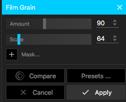
As you can see on the right I also made a few subtle adjusts to the photo in order to enhance it. As you can see below the original photo was more dull and overcast so I increased the brightness and exposure along with the saturation in order to enhance the sky. I also increased the blue tone levels in the photo as I wanted to enhance the already blue shade of the sky. I also added a warmer tone to the photo as I feel that the original is a little too cool toned. |
|
Original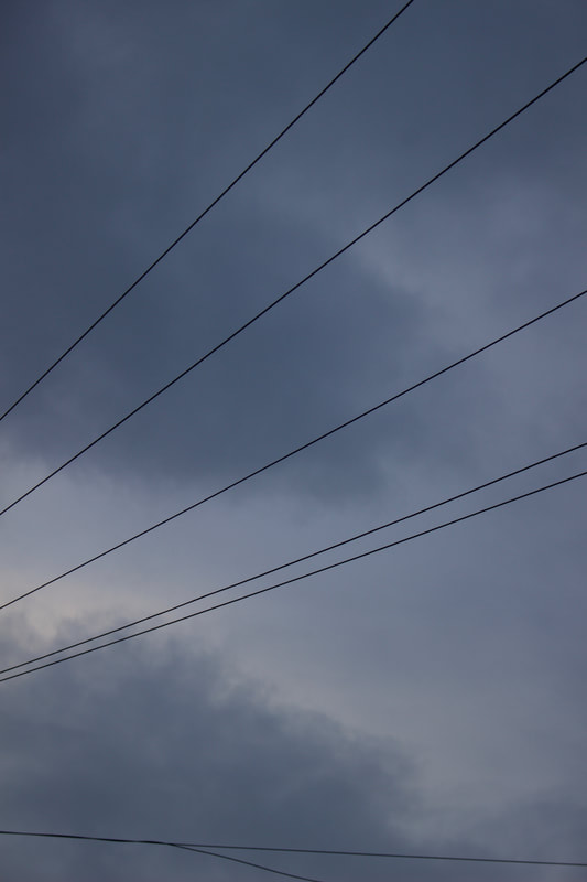
|
Edited
|
As you can see I enhanced the colours in the image and gave it a more warm town as I feel I may have used the incorrect white balance when taking the photo resulting in an overly cool toned and overcast image. I did similar edits on the rest of the photos so I didn't feel that I needed to include each individual editing process.
Below are my final images - I am happy overall with how they turned out and I feel that they are a good representation of minimalistic beauty within nature - which is what I aimed to capture.
I do feel that they could be more visually cohesive but overall I am pleased that I fulfilled my aims for this shoot.
Final Images
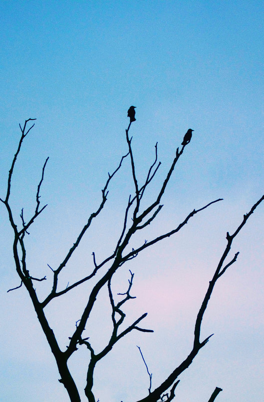
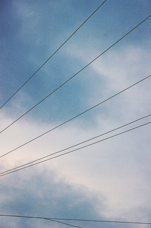
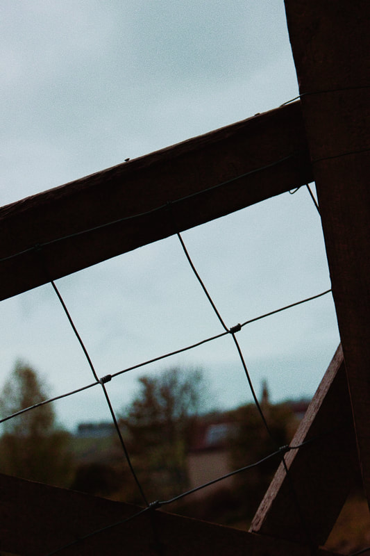
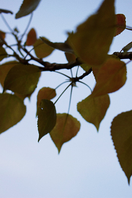
Shoot 8
For this shoot I wanted to take on a different angle to 'minimalism'. - I decided to do a shoot with the idea of minimalism falling into every element - not just the appearance of the photos.
I wanted to try out a minimalistic lifestyle approach for shoot as a deeper exploration of the theme, in order to enhance my understanding and appreciation of minimalism.
In order to do this I chose to shoot with a phone rather than a camera - in an attempt to contradict the idea that you need a big expensive camera to take great photographs. I shot these photos on my iPhone SE - again not the newest and most high definition phone camera out their, but it works!
Also I only took a minimal number of photos - as you can see from my contact sheet - in order to give myself more of a minimal selection of photographs to choose from.
I edited on a phone app called 'VSCO Cam' which I've used for a few shoots before - proving that expensive software such as photoshop isn't necessary - I have never got along with photoshop and I don't think that this makes my photography any inferior than photographers who do.
I feel that this minimalistic thought process- along with my usual approach of unexpected perspectives and minimal image framing - worked well and helped me to further understand what minimalism really is.
I took these photos on a family trip in wales at the weekend, we found a beautiful nature walk on a sort of mountain range, I used my phone and captured some of the natural beauty that surrounded me. It had a very calming and still atmosphere that almost allows one to step out of day to day life and just take a moment to appreciate nature around us.
I didn't intend to use this as the location for my minimal lifestyle shoot but when I started to climb and see the beautiful scenery, I knew that this was the place.
I believe this shoot was a successful exploration of minimalism as a lifestyle approach and I feel I relevantly linked every aspect of the shoot to minimalism as a concept.
Contact sheet and Editing...
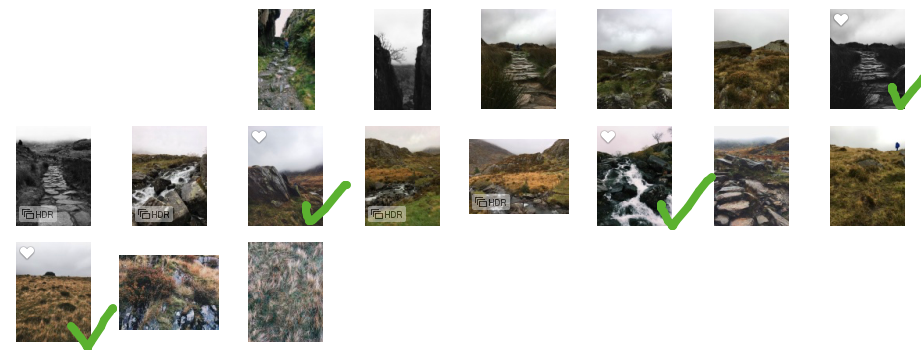
As you can see from my contact sheet I only took 17 photos as part of my exploration into minimalism in a wider sense.
From these I chose 4 final images that I liked as I feel they are all visually interesting and decent quality photographs considering they were taken on a phone!
I feel that each of my chosen photos has similar leading lines; the eyes are naturally drawn towards the bottom of the images and guided up, this is arguably because they are mostly taken from below angles as I was walking on an upwards incline but it could also possibly be to do with the dimensions of the phone's set depth of field and I wasn't able to adjust any setting like this on a simple phone camera.
Despite this I do like all of the photos. Even though I couldn't manipulate the setting, in order to have more control over the final outcome and I feel this was the only downfall of my minimalism exploration.
Within my editing I only allowed myself to use two filters - one colour and one black and white. I made this decision because Ideally I would have put all the photos into black and white to create a minimal tonal range of colour across the photographs but I felt that by doing this a lot of the natural colours in the photo were discarded which I didn't want to do as the natural tones are so beautiful.
So I edited one photograph in black and white as I felt it worked well for that particular image and then applied the same colour filter to all the rest of the photographs in an attempt to create a cohesive mini series of iPhone photography.
Original |
Edited |
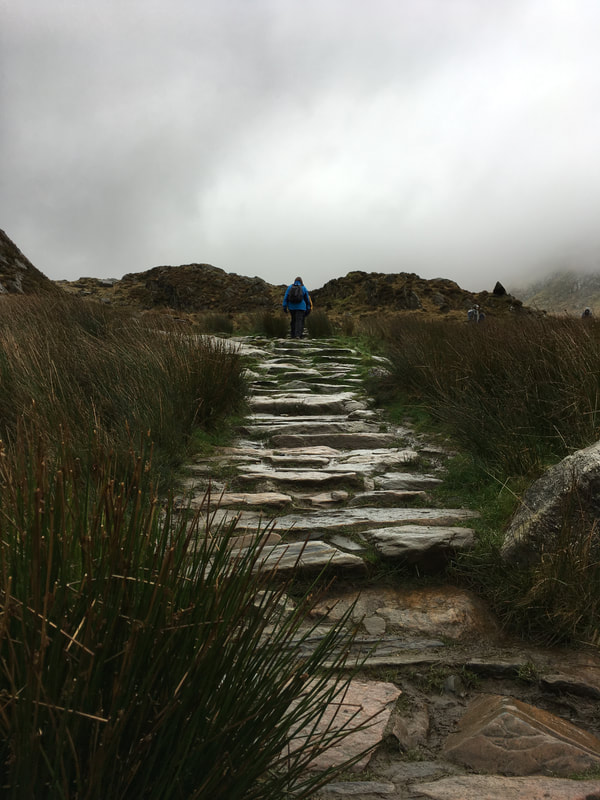
|

|
Here is an example of one of the edited photographs.
I chose to edit this photo into black and white because I wanted to keep the focus on the steps in the centre of the image and thought that minimising the tones in the photo would help with this.
As you can see by editing it into black and white it takes the unnecessary attention off the bush in the bottom left corner and the varies colours in the grass and the man walking.
I think this gives the photo a better visual effect as it simplifies the overall appearance and keeps the attention on the beautiful shading and shadows of the steps. I feel that the black and white also helps to enhance the depth of this photo.
I am happy with how the final images came out and I think they were successful in proving the theory that you don't need a 'big expensive camera' to take 'good' photos.
Also through this deeper exploration of the true meaning of minimalism I've been inspired for my final piece. I hope to have 3 glass clip frames, presented in a row, as a small series of simplicity. As after this exploration I don't think it would be fitting to present my photos on a giant creation or extravagant frame as this is not minimalistic.
I also want to include an element of nature within my work if possible, so depending on what nature scenes are involved in my final 2 shoots, will decide what element of nature I choose to include in my final piece.
Final Images
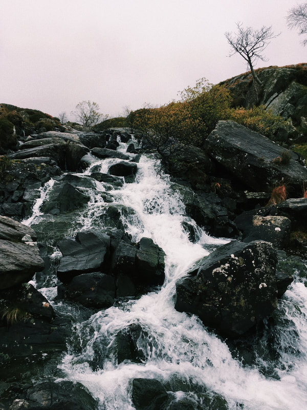

Shoot 9
As I am coming to the end of my project I am thinking more and more about what I want my final piece to be.
Last week I decided on the basis of my final piece, but in an attempt to decide what my final shoot will entail, I've decided to do a shoot that incorporates my theme of minimalism along with my love for working within nature and shooting fashion style photography.
I have decided that I want to incorporate all my favourite elements of photography into my final shoot, as I feel this will help the photos to best represent me as a photographer and show how I have come to find my own personal style within my personal investigation throughout components 1 and 2.
My original location plan for this shoot was a corn field/flower field as I had an idea in my head about how that would look, I found this field - that coincidentally is a corn field at some points of the year but at this time of year its filled with beautiful rich green crops so I decided I would work with it!
So although it's not the exact location I planned to work with, I feel that the pictures still work nicely in this location.
Shoot plan/ Styling...
|
I conducted this shoot in a similar way to fashion portraiture shoots I've done in the past; I chose a location and styled my models hair, makeup and clothing.
I chose to dress my models in contrasting colours as you can see below - I dressed my first model in orange as I wanted to have a shade that would compliment the greens of the nature around. I chose a vintage 80s style disco dress as I thought it was something fun and different and features interesting shapes as well as an asymmetrical hem in order to successfully create an interesting visual effect. I dressed my second model in a black playsuit with off the shoulder shaping as I feel that this shape is very complimentary in photographs and works well with the photographs I took of this particular model.
I also used additional props throughout the shoot such as blue sunglasses for my second model and a blue linen scarf for my first model - used for creating shapes and contrast with the orange colour of the dress.
I think these contrasting looks work well together as the light and dark tones compliment one another and both bring a different element to the background of nature. The orange works as a stand out, collaborative colour with the green and brown earthy tones while the black acts as a stark contrast which brings more attention to shape. Although these looks are both different, I think they both work for the individual models and have a flare of femininity that gives a new lease of life to the photos and aids the visual impact. |
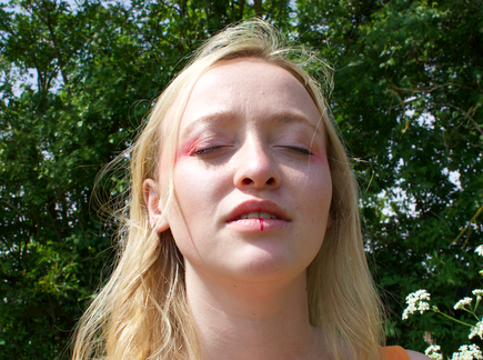
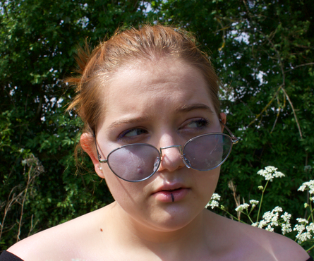
For the makeup I did the same design on each model but used different colours.
As you can see from these photos above, for my first model I did a pink themed look using highlighter and eyeshadow with a darker eyeliner shade stripe down the centre of the lip. I did this same design on my second model but used blue as the focus colour and a darker blue liner on the lips. The makeup is clearer in the first photograph although the second model did have the same makeup just in blue. I came up with this look by thinking about colour and unusual places to put it - hence the reason the pink and blue colours on the models are placed in an unusual place for this type of makeup. I also wanted to have a linear effect within my work as it's been a running theme through my project - hence the stripes down the bottom lip of each model. I feel that these makeup looks add a more edgy and alternative feel to the shoot and bring in the youthful fun spirit that I always try to create in my work. |
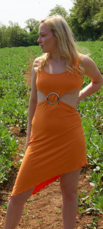
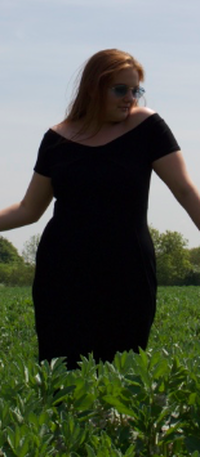
Contact Sheet and Editing...
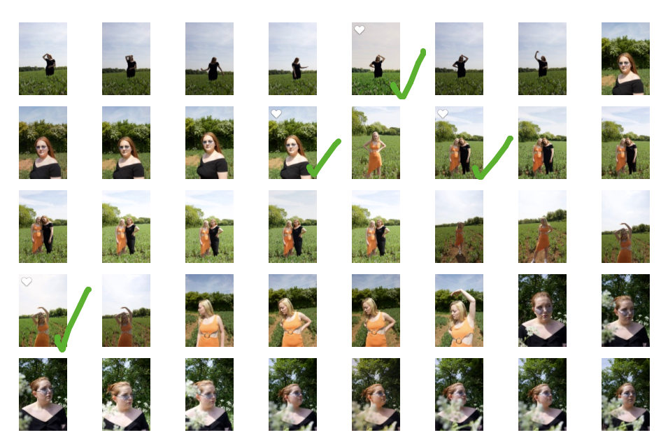
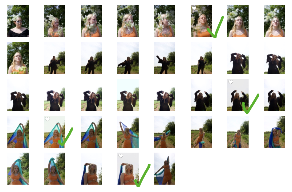
From my contact sheet you can see I played with a lot of ideas in this shoot in order to try and capture the best photos.
I wanted to maximise my use of the nature surrounding, so I shot from many different angles and areas of the field.
I am happy with the visual diversity among the photos I've taken, as often with a shoot like this, a lot of the pictures end up looking the same, whereas all the final images I've selected for this shoot, are individual and all present a different perspective from the same location.
I have chosen 8 final images that are all different but work well together and include a variety of portraits inspired by minimalism and unexpected perspectives.
The final images show a wide variety of tones, as the positioning of each photo, means a different positioning of the sunlight. Some photos are vibrant in colour as they are taken in direct sunlight, while some were taken with the sun behind, resulting in a light background and an overcast model.
I think this is important to include as it shows how I can adapt to different light situations and the resulting camera settings in order to still take successful photographs.
Original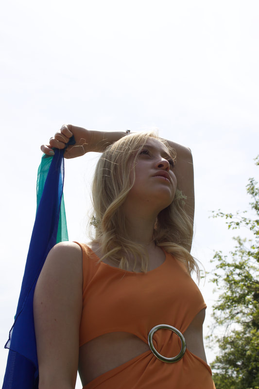
|
Edited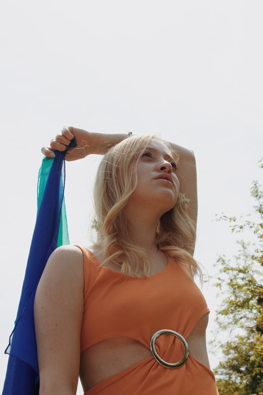
|
Here is an example of one of the edits.
I brightened the colours and enhanced the warm tones in the photo as I wanted to give it the visual effect of summer.
I like the colours I created in the edited version and think they work better visually as the models face is brighter and more visible.
The only issue with brightening the model meant that I had to slightly darken the background in order to balance out the photo. Despite the off-white nature of the edited background I am still happy with the photo as I feel the edited version looks more balance and for me I don't personally feel the off-white background looks particularly bad.
This background colour issue was caused because of the difficulties of working with harsh natural lighting.
As you can see from the original image, the sunlight is behind the model which means that the background is bright but the model is left looking dull and overcast in the shadows - hence the reason for the edit.
This project is evolving into a collective of all my favourite elements of photography in respect of unexpected perspectives; Fashion portraiture, nature shooting and minimalism.
This shoot has helped me to decide on my final shoot and aided my preparatory work for that shoot as this was a similar setup to what my final shoot is going to be.
Overall I believe this was a successful shoot, I am happy with the photos and it has aided my final shoot idea/plan.
Final Images

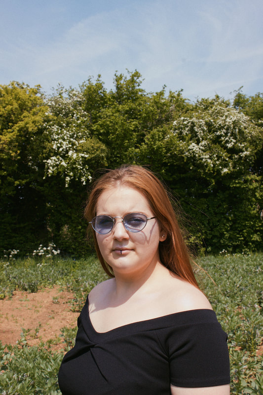
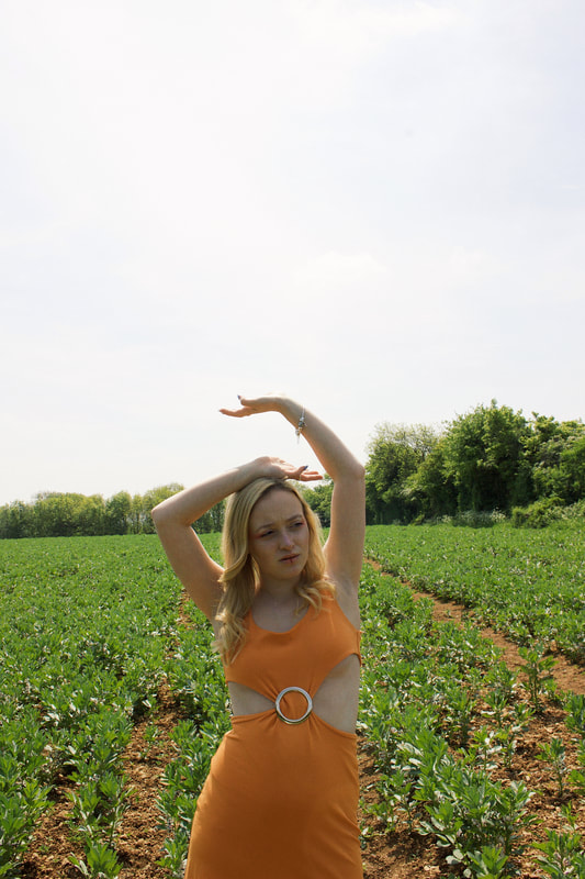
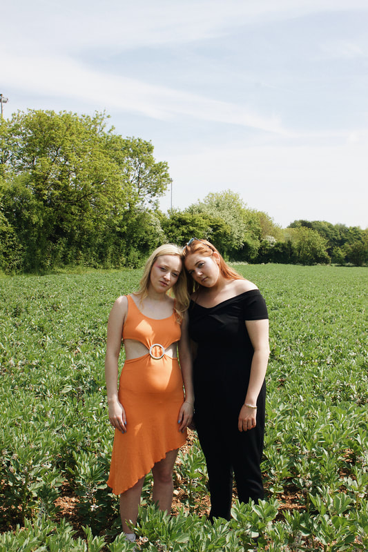
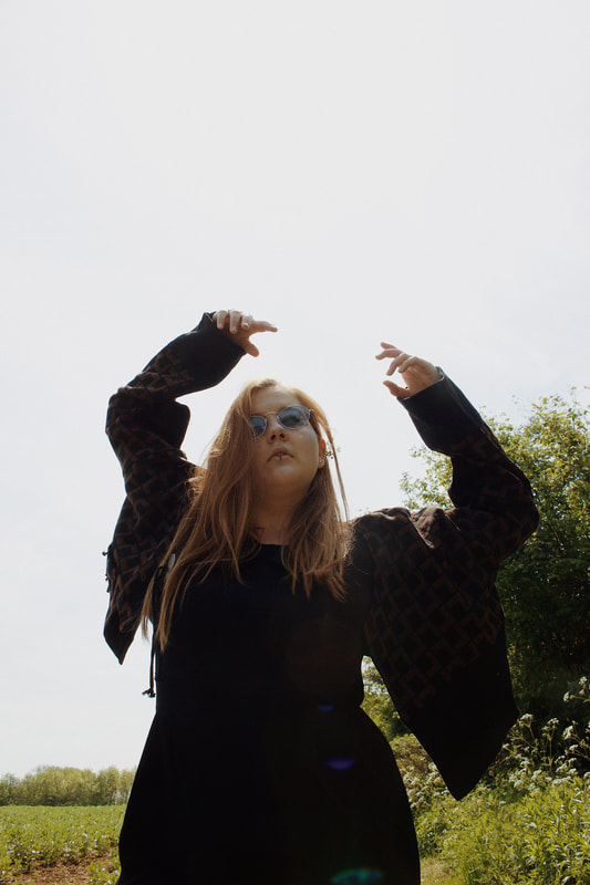
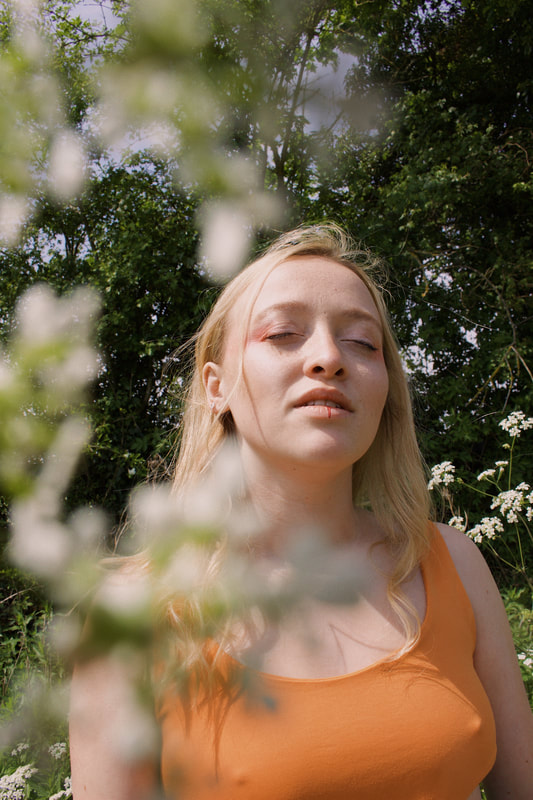
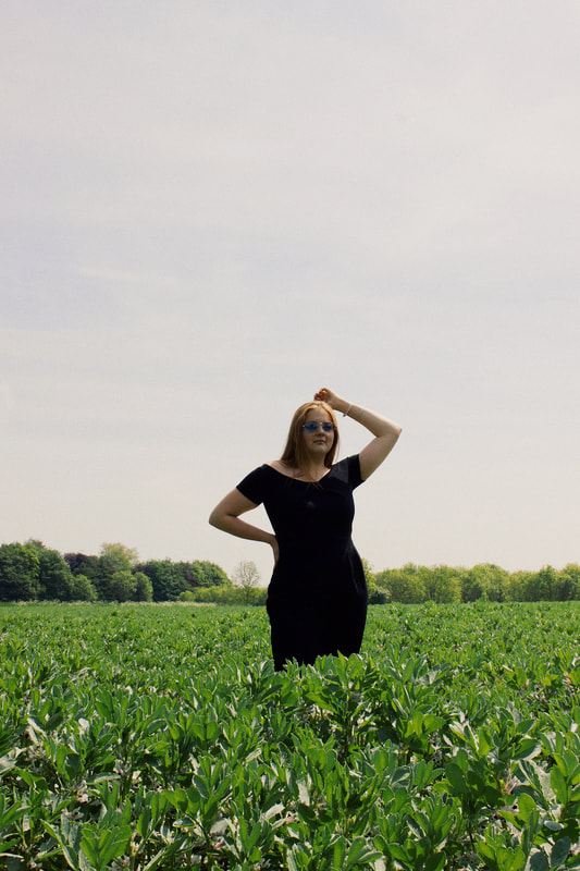
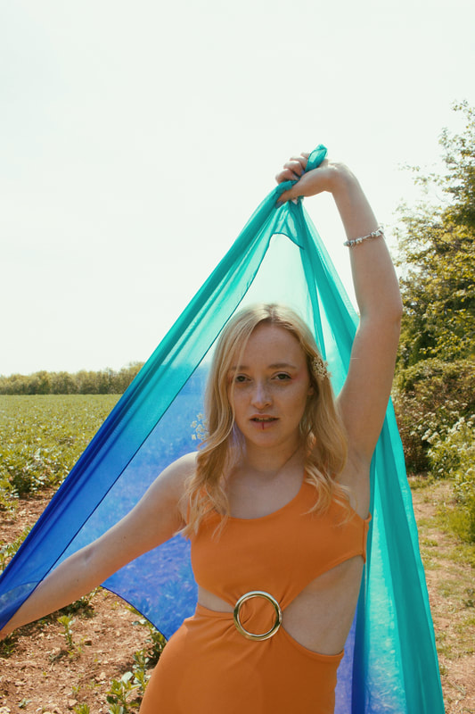
Shoot 10
My final shoot!
For this shoot I wanted to create photos that represent my project as a whole and show my growth of ideas throughout.
I looked over my project and the key visual features I picked out were;
- use of nature
- use of colour
- use of lines
- use of blurring props (bubble wrap)
- use of portraiture (from unexpected angles)
So from this list, I decided I would try and incorporate the visual ideas that have worked well in my project previously.
I decided on a location for the shoot; Alexander Park and decided I would explore the different landscapes and plants when I got there, as I didn't want to plan out each photo, because I like to take a more spontaneous approach when doing a photoshoot. I have this spontaneous approach to photoshoots, because I feel it's more fun when I don't have planned out in my head exactly what I intend my photos to look like, as this can block the natural creative flow that comes to me in the moment.
So in preparation for this shoot, all I did was;
- decide shoot location
- tell my model to wear neutral/no makeup
- decide on a dress for model to wear
- bring bubble wrap (to use as blurring camera effect)
I made the creative decision for my friend Lucy, who I used as the model for the shoot, to wear very little makeup as I knew I was shooting among nature, so I wanted to reflect that natural look with the model. I also feel that wearing little to no makeup works well within the theme of simplicity and minimalism as the more visually minimal the makeup, the better it works with the theme.
As for the styling, I told my model to also leave her hair natural and picked an earth-toned brown/orange dress for her to wear.
I think my styling for the shoot worked well both with the green nature of the background and with the theme of minimalism.
The brown shades of the models hair and dress contrasted with the tones of the grass and leaves perfectly creating a range of varied tonal images.
I shot from a variety of different angles and captured unusually angled photographs in order to connect the shoot to unexpected perspectives as well as minimalism, because I felt it was important for my final shoot to be a reflection of my interpretation of the project theme; unexpected perspectives, minimalism.
Contact Sheets...
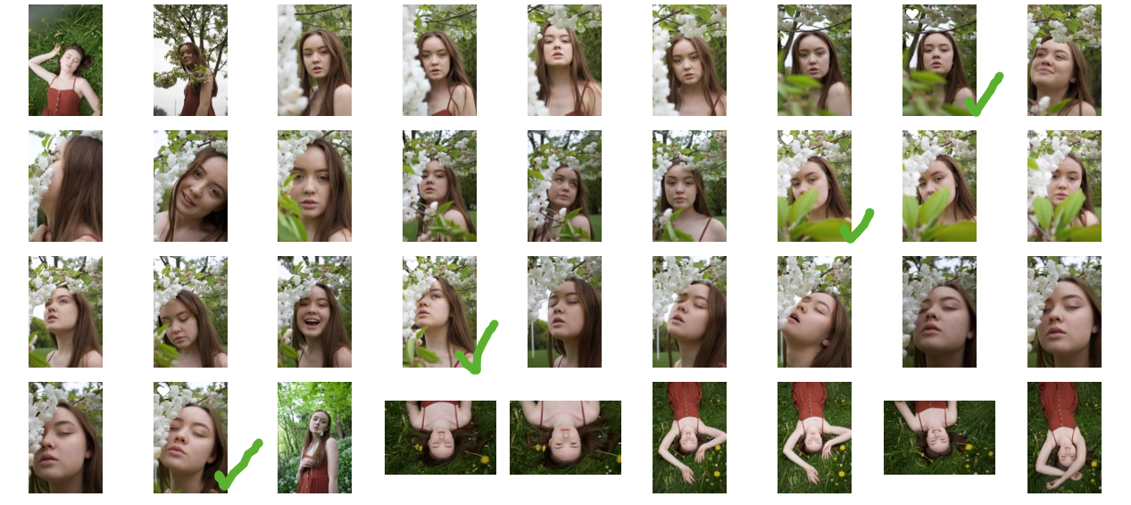
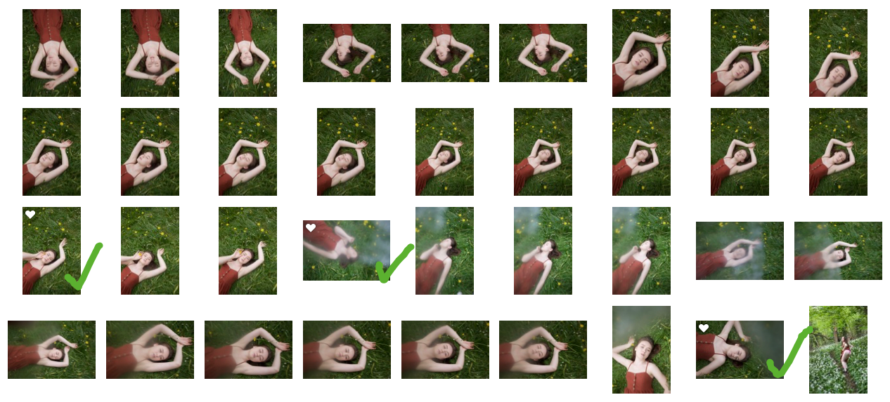
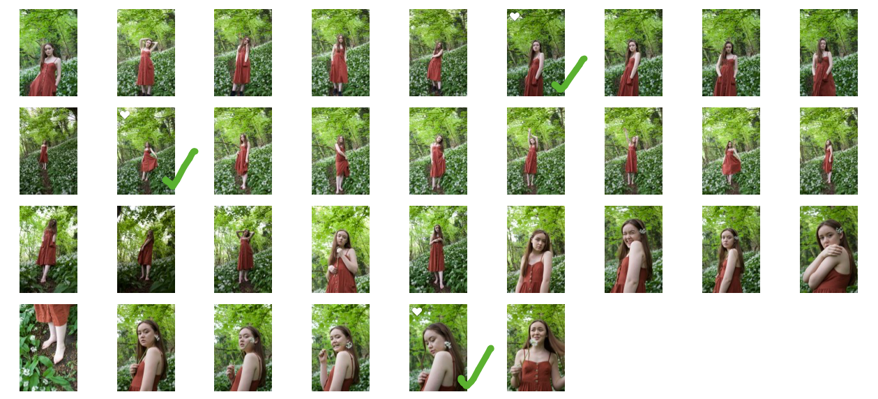
As you can see I took many pictures for this shoot and experimented with many different locations and angles.
I wanted to make the most out of the different locations I found within Alexander park.
The main scenes I used for the shoot:
- Forest area filled with white flowers
- Daisy and dandelion covered grass
- White blossom tree
From these photos I have chosen 10 final images as this is shoot 10 after all!
I have presented them as 3 mini series from each of the scenes listed above.
I have tried to create a visual variety among my selected final images, as I wanted to show the diversity of perspectives from the shoot. I think that I have successfully done this as the portraits are all different in shape and composition, creating a series of individual photos. - As often I feel final images can look too similar to one another, especially within portraiture.
Editing...
|
When editing this shoot I initially used the software 'Photoscape X' but after looking over my photos again I was unhappy with the editing; It seems too bright and over saturated for these photos - I want to create a more muted and shadowed type of appearance.
I have included this initial editing process anyway as I think it is important to show the development of ideas building up to the final result. |
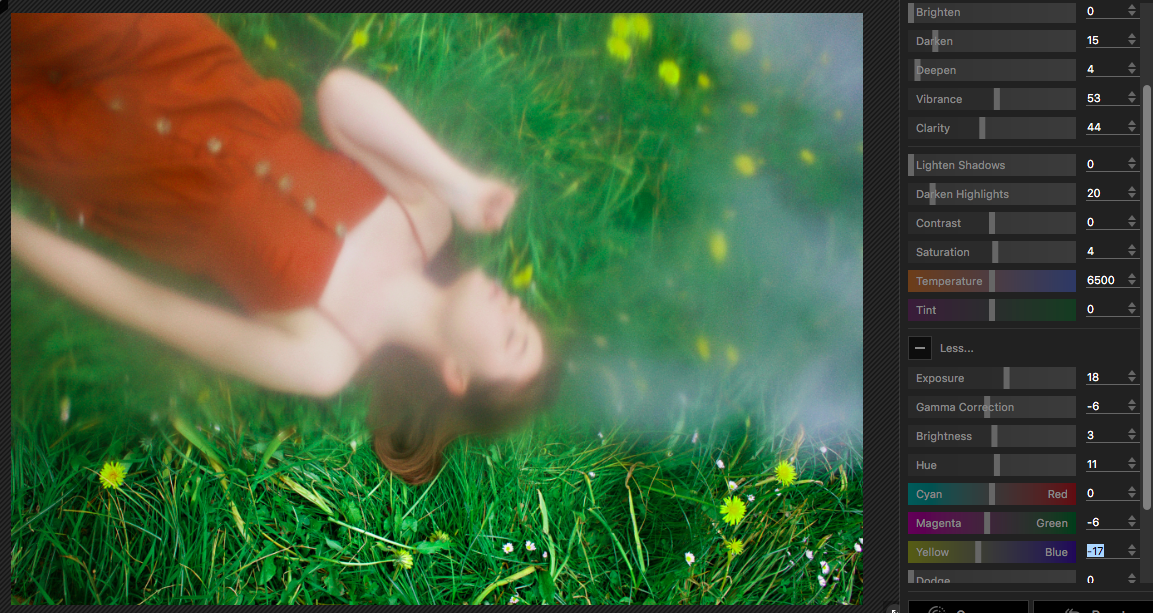
|
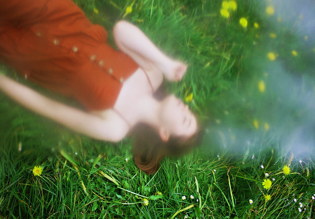
Above is the full size of the original edited image - created using 'PhotoScape X' - I like the colour contrast of the warm orange against the cool toned green. But I think that when editing I increased the green tones too much as the daffodils have a slight green tinge which I dislike. I also feel that the harsh shadows and contrast in the grass looks too artificial and I want to create a more natural looking image.
The same artificial appearance applies to the saturation, as I clearly over saturated this image - making the edit look amateur and highly unprofessional.
I think that where I went wrong when editing this photo was my focus - I was focusing on the tones of the models skin and clothing instead of the overall appearance of the image.
Which resulted in only one part of the photograph being well saturated, and the rest being oversaturated.
From this photograph, I have learnt that when editing I need to look at the image as a whole and make sure it works, as this is how an unfamiliar eye will see it.
Here is VSCO cam - the phone app I used to edit the photo below. I have also included some of the available editing options that the app has - it is a lot more than filters, it allows a lot of creative freedom when adjusting photograph settings. |
|
When editing with VSCO I thought more about the overall image as I didn't want to make the same mistake I did when using 'PhotoScape X'.
I made sure that I was keeping the saturation balanced and creating a cooler toned, more levelled out photograph. I think that this cooler tone works well with this photo as a lot of the colours in the photo are naturally warmer, so by increasing the cooler tones it helps to balance the tonal range of the photograph, eliminating any harsh contrasts.
I made sure that I was keeping the saturation balanced and creating a cooler toned, more levelled out photograph. I think that this cooler tone works well with this photo as a lot of the colours in the photo are naturally warmer, so by increasing the cooler tones it helps to balance the tonal range of the photograph, eliminating any harsh contrasts.

Above is the final image - edited on VSCO.
I feel that this edit helped to create the dream like effect that I wanted for this image as the blur across the photo almost makes it seem as it the model is floating. This edit helped to enhance the blur around the edges of the skin - creating less shadow and slightly lighten the blue area on the right of the image.
I think the colours in this photo all work well together with this edit and the upside down/diagonal angle of the model fits perfectly into the idea of unexpected perspectives and further encourages the dream-like state of the photo.
This edit also helps to enhance both the cool and warm tones in the grass - the daffodils and brown blades of grass are clear, along with the green blades.
Edit Comparison
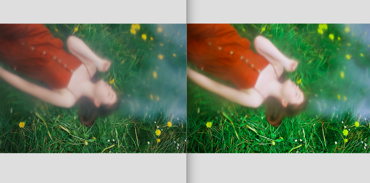
Here is a side by side comparison of the two edits (left - vsco, right - PhotoScape X)
I have included this comparative photo so you can see the visual differences I've previously explained for each edit.
It is clear the the left photograph is much more balanced than the right.
It is also clear that the left is darker and more cool toned, creating an more dream like feeling while the photo on the right is very visually overbearing due to the over saturation.
Original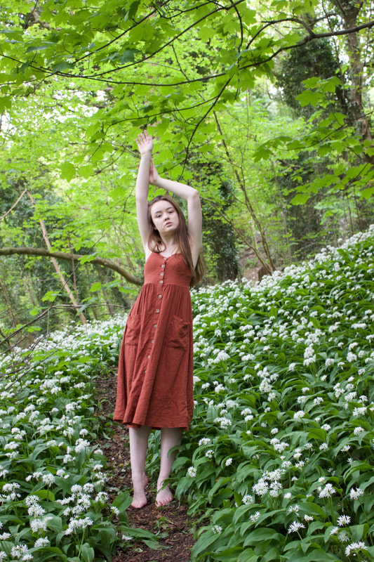
|
Edited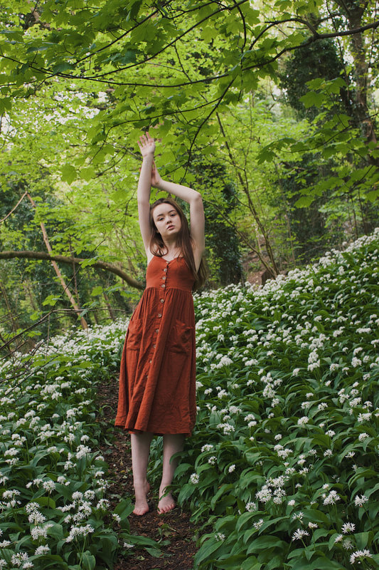
|
Here is an example of the preset I used on my final images - it does not include the individual settings I edited for each but gives a visual comparison of the colouring difference between the original and edited photographs.
I didn't end up selecting this photo as one of my final images, as I had so many to choose from, but wanted to stick to a maximum of 10. What I like most about the preset I selected is the depth it adds to the photos, it creates flattering skin contours as well as adding depth to the background and enhancing the contrast of the branches.
The preset enriches the natural shades in the photo and adds a slight warmth to them that I feel really enhances them aesthetically.
I am happy with the editing of these photographs and pleased that they turned out as well as I imagined.
Final Images
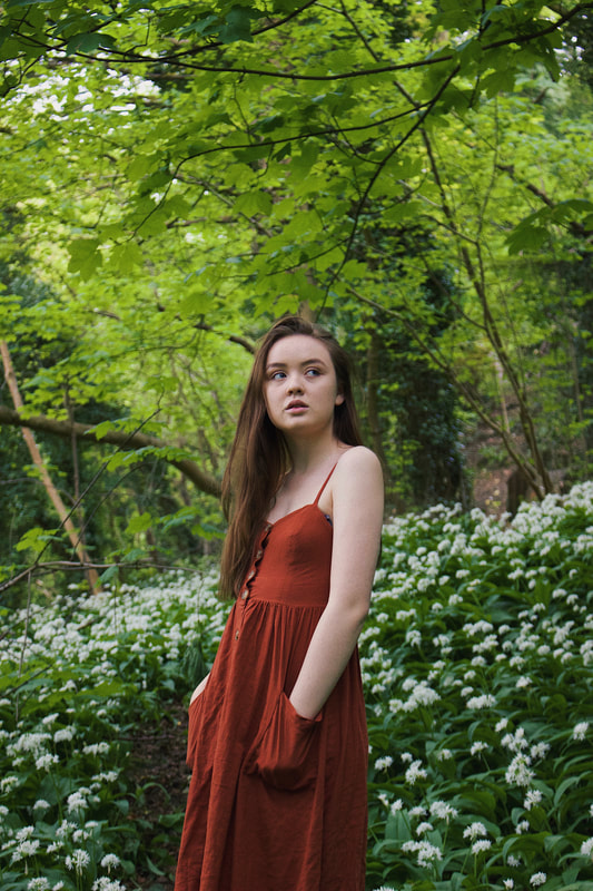
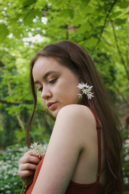
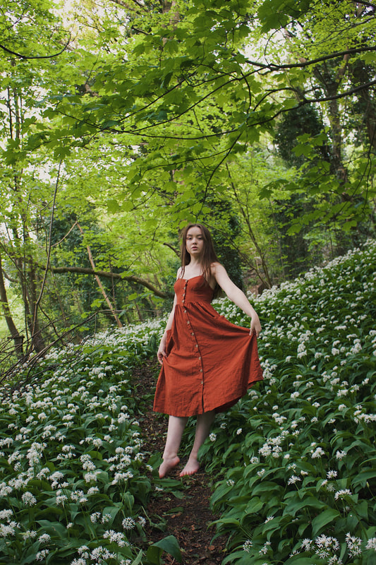
These first 3 final images were taken at my first scene - the forest filled with white flowers - As you can see I experimented with different angles and framing, ranging from full body shots to close up portraits.
The first from these 3 images is the one I selected as part of my final piece.
The first from these 3 images is the one I selected as part of my final piece.
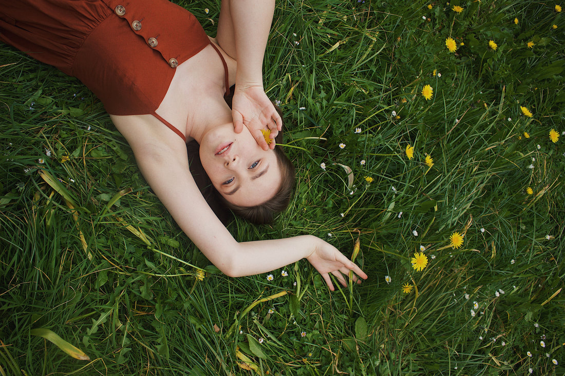

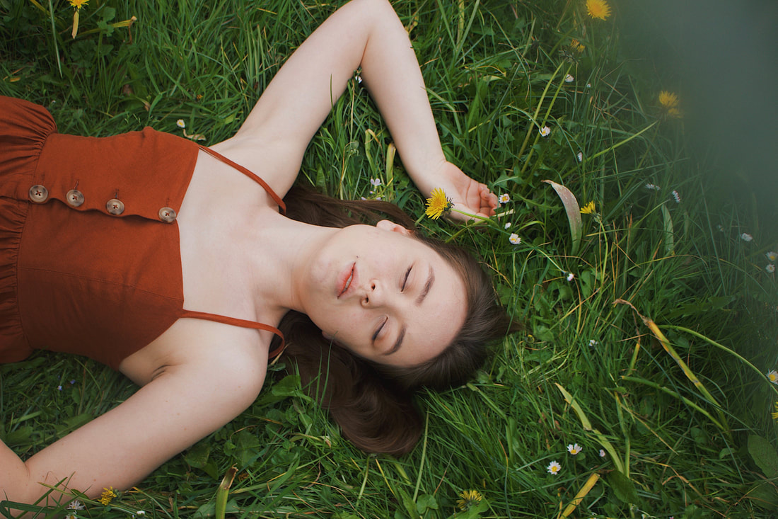
These 3 images were taken from my second scene - the daisy and dandelion covered grass.
For these photos I got my model to lie down so I could shoot from above - as I wanted to play with a different perspective that I haven't before; bird's eye view!
I chose the second image from these 3 as part of my final piece.
For these photos I got my model to lie down so I could shoot from above - as I wanted to play with a different perspective that I haven't before; bird's eye view!
I chose the second image from these 3 as part of my final piece.
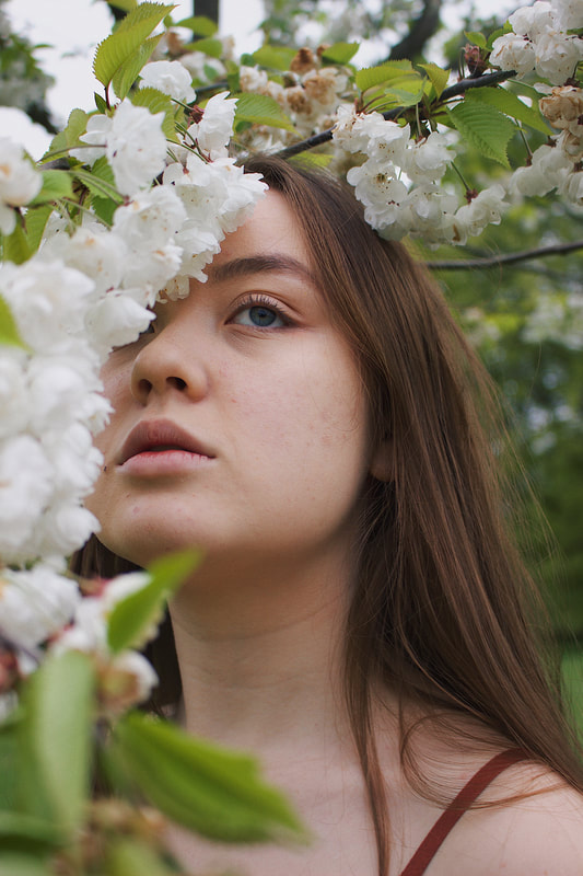
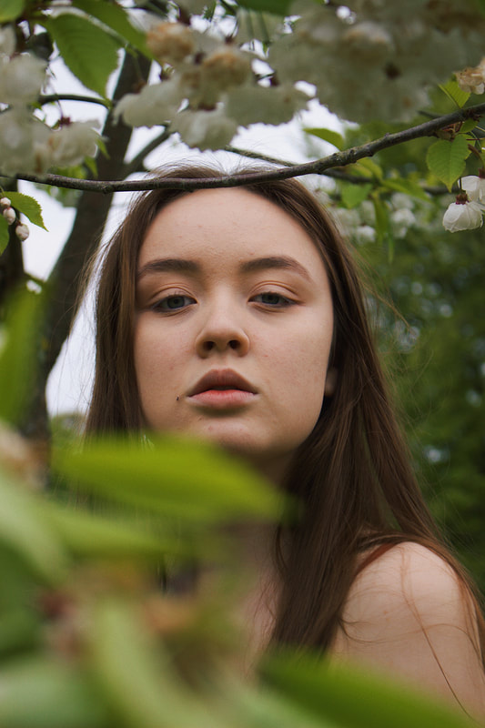
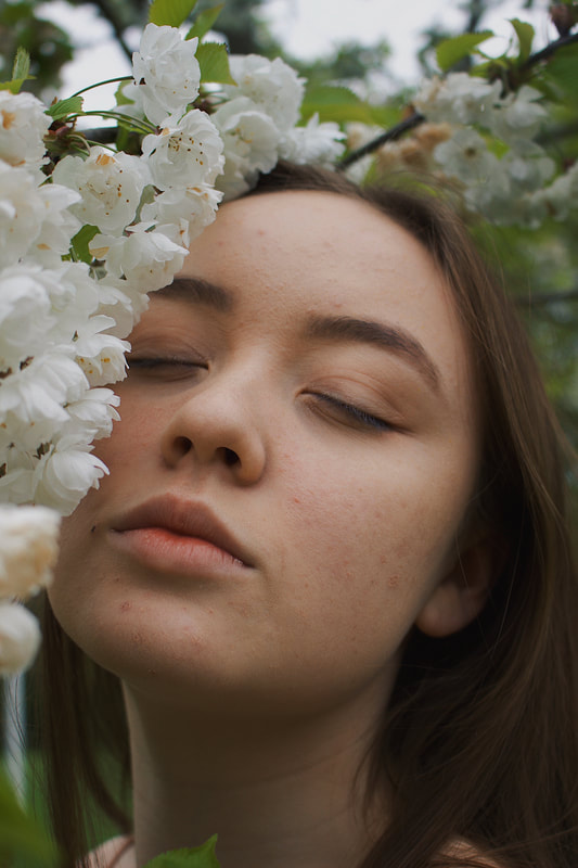
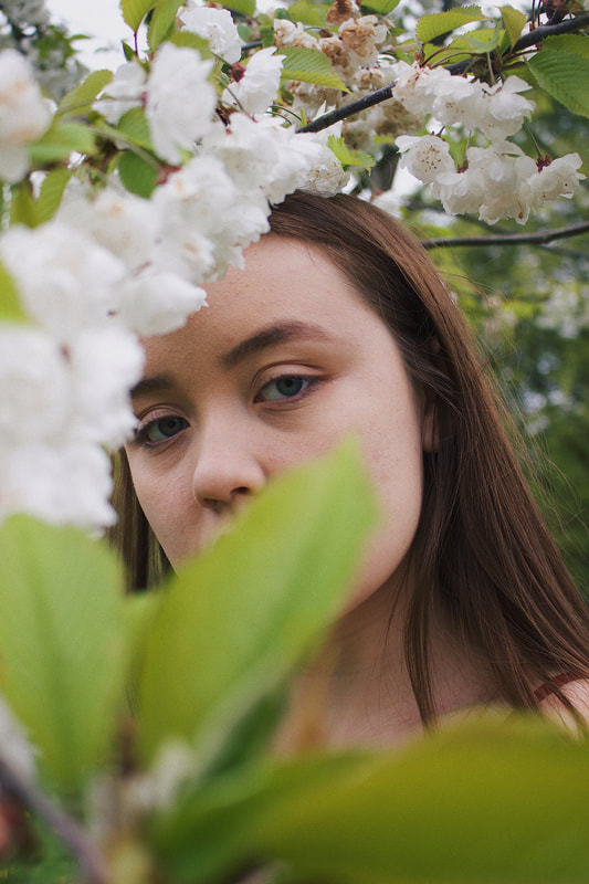
These are my last 4 images from the final selection of 10 - shot at my third scene - the white blossom tree.
When shooting here I experimented with focal point and angling of the leaves - as I used them to add a blur and splash of colour to the photos.
I chose the first of these 4 as part of my final piece.
When shooting here I experimented with focal point and angling of the leaves - as I used them to add a blur and splash of colour to the photos.
I chose the first of these 4 as part of my final piece.
Final Piece
For my final piece I decided to present my photos in simple frames as this goes hand in hand with my theme of minimalism.
I chose A3 sized clip frames, I chose to have 3 frames so that I could have one photo from each of the 3 mini series within the shoot 10 final images.
From my 10 final images of shoot 10 I decided on 3 photos to use for my 3 final piece frames.
I wanted to include a cohesive theme of minimalism alongside nature in my final piece.
I printed my photos onto A3 photo paper but the photos are A4 which leaves a white border as an effective area of negative space, in order to create a visual effect of minimalism. I also wanted to include real nature within my final piece as well as the visual representation of nature in the photos, this is where I had the idea to press flowers onto the photos.
I did a different arrangement of pressed flowers on each of the pieces and tried to make the flowers blend in with the photographs, to almost create the effect that the pressed flowers were part of the images.
I chose to have a white border around my photos as the white flowers and light tones in the photos work well with the white background and enhance one another.
Overall I am really happy with how my final piece has turned out, it is how I imagined it would be when designing it.
The only downfall of my final piece is the slight difference between the digital photos and printed ones - as the prints turned out to be slightly darker and this changes the level of shadow and colour.
Despite this I still think the final piece is a true representation of my project and it reflects how my ideas developed throughout into a final result, that is a perfect depiction of what unexpected perspectives means to me.
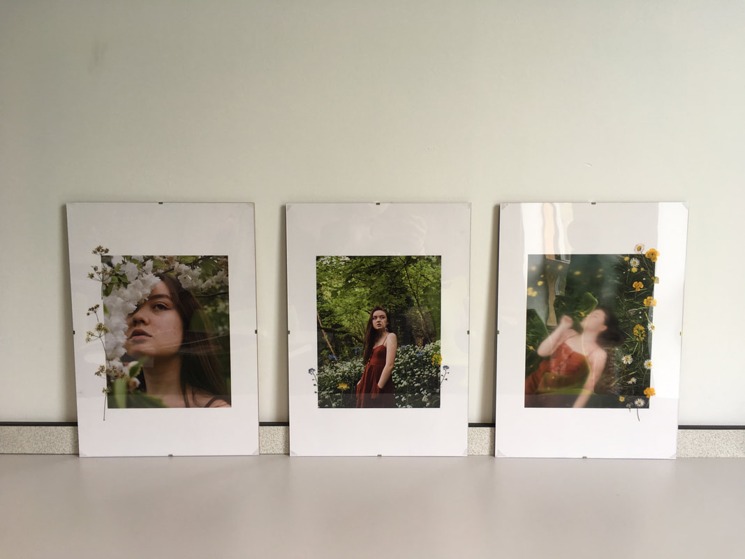
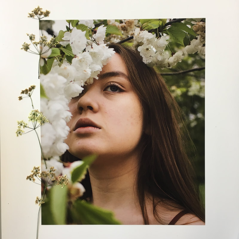
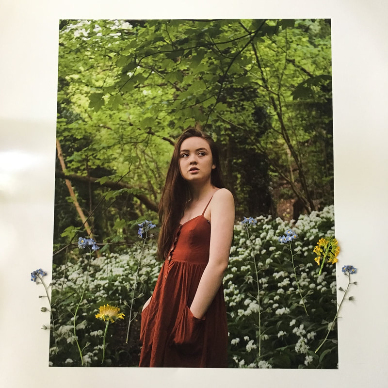
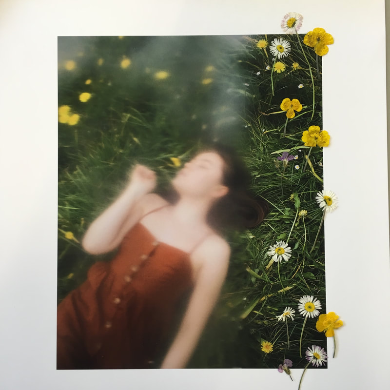
Project Analysis
I was inspired by many photographs for this project, the main ones being; John Batho, Julian Schulze and Cole Sprouse.
I discovered both John Batho and Julian Schulze through research of minimalist photography, whereas I already knew of Cole Sprouse as an actor, but only recently discovered his photography when coming across his instagram page.
From studying these photographers I have learnt that sometimes the unexpected is what works best and often what could be perceived as a fault, can photograph beautifully. - For example Sprouse did a shoot where he covered most of the frame with a sheet of plastic and only had a small hole where the landscape behind was revealed. - This use of plastic could be perceived as ugly or you could look at the obscured perspective it brings to the landscape behind and appreciate it. I have included a photograph of this previously in my project which is a photograph of sam smith stood among the landscape that is partially hidden by the plastic sheet.
John Bathos use of shameless motion blur has taught me that a photo doesn't need to be ‘perfect’, in order to be a great photograph.
While Schulze has taught me that there is beauty in the ordinary and art is totally subjective - what one person perceives as bland someone else can perceive as utterly extraordinary.
I explored the theme of unexpected perspectives and within that I focused on the perspective on minimalism.
When choosing unexpected perspectives for my project, I had minimalism in mind from the beginning, as it is a visual concept that I have always been drawn to and appreciated.
However my ideas surrounding minimalism changed and developed as the project went on; Initially I focused on linear photos and still life but after doing this for a few shoots I felt that this wasn't something that really connected with me as a photographer. So then I decided to venture in minimalism within portraiture; I started with animal portraiture, which was a new concept for me and then went on to more fashion style portraiture - as this is a style of photography that I am familiar with and feel connects best with me as a photographer. However one thing that I kept constant throughout was the use of nature - all of my shoots were shot in nature.
I chose to keep nature a constant throughout this project as I wanted to use it as a device to present viewers with the beauty that surrounds us in everyday life, as this is a concept I am always trying to push forward and present people with; We take the world around us for granted and I aim to change that through my photography.
I believe that I have shown a wide use and understanding of unexpected perspectives and minimalism as I have acknowledged how minimalism is not only a style of photography but also a general art that can be applied to anything from fashion to interior design. Minimalism is also a lifestyle, which I briefly explored in shoot 8, by attempting to make every element of the shoot minimalistic; the camera, the editing, the location etc.
I feel that I have shown an understanding of what unexpected perspectives mean to me as I have talked about how photography can be used as a device to show people a different side of things and cause people to perceive things differently through the use of different perspectives.
Within my project I have development my own visual and conceptional interpretation of what unexpected perspectives and minimalism means to me and how it influences my work. I feel that these themes are clearly presented in my work and that I have managed to explore different styles within them, for example, in shoot 6 I aimed to bring a different concept to the architecture of playground equipment, as I shot interesting angles of park play equipment to create visually interesting images through the use of lines. The photos from this shoot also hold a visual effect of minimalism and simplicity which aids the use of unexpected perspectives as it allows the viewer to focus on the linear effect of the images, without distraction.
I have also come to appreciate the significance of chance - meaning that within photography, often the best photos are a result of chance, as you cannot ever have full control over what the camera picks up when you press the shutter.
You also don't know what photo opportunities you will be presented this, this is why I carry my camera with me whether I go incase something comes up. An example of this is the photo of the lanterns from shoot 1; I was visiting my sister in exeter for the weekend, not expecting to do a shoot, although I had my camera with me of course and I came across these bold red lanterns hung across the street - against the deep blue shade of the sky they look magical - and this photo ended up being my favourite from the shoot, and possibly one of my favourites from this whole project!
I also believe that the use of nature among my project supports this idea of chance and gives my photos a feeling of spontaneity, as none of the shoots are taken in a studio, which disregards any feeling of artificiality in respect to lighting and staging.
The ideas that I feel worked best throughout this project were the use of props in order to add a blurred dimension to the photos; for example, in shoot 3 I use bubble wrap to create a blurred effect in some of the photographs and in shoots 9 and 10 I used flowers and leaves to create this same blur. I created these blurred dimensions by holding the props up to the lens of my camera and adjusting the focus to be on the model. I think this idea was something that worked well throughout the project as it gave a personal appearance to my work and helped me identify my style within photography.
As I’ve mentioned already, I am happy with my final piece as all my ideas came together and worked well. I am especially happy that I decided to use pressed flowers as I think this adds another element to what would have been simple framed photos. I think that I kept my final piece well within the concept of minimalism and presented the unexpected perspective of photographed flowers among real pressed flowers.
If I had more time, I would have liked to do an additional final piece using a vintage 35mm camera I have, with black and white film - I mentioned this in shoot 7 - as I intended to shoot snippets of my final few shoots, but as I was tight for time, I was not able to get these photos developed. I wanted to do this, as that type of camera and film was the most common in the 1950s, which was the time when the concept of minimalism was first introduced.
In the future, I will definitely be experimenting more with film cameras, as I feel that in this digital age, the charm of physical photos is often forgotten.
So alongside my photography promoting appreciation of the world around us, it can also inspire a rediscovery of the art of the physical.
Project Overview
Shoot 1 |
Shoot 2 |
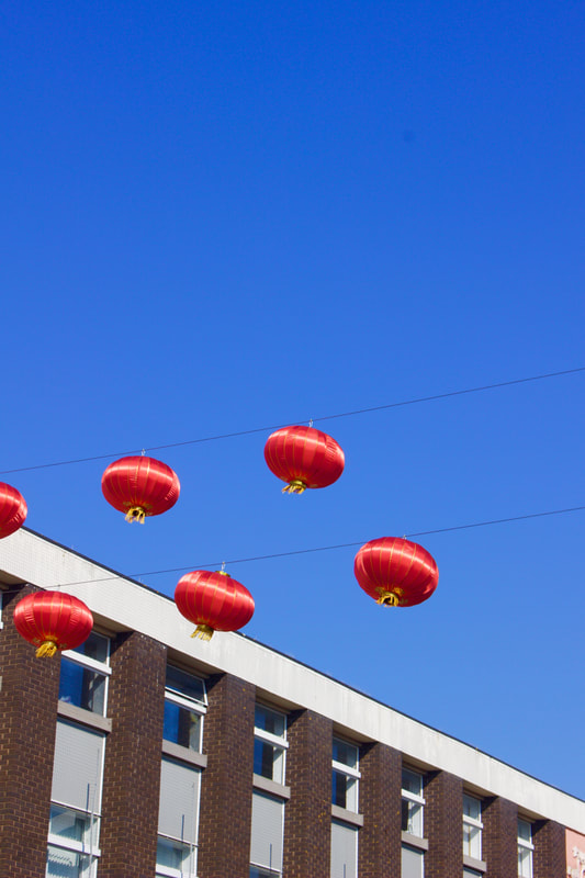
|

|
Shoot 3

Shoot 4 |
Shoot 5 |
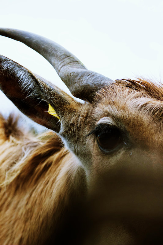
|
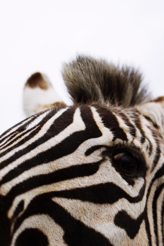
|
Shoot 6 |
Shoot 7 |

|

|
Shoot 8 |
Shoot 9 |
|

|
Shoot 10