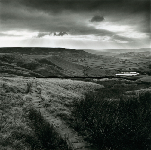
Photographer study - Fay godwin


In depth analysis:
Technical - The lighting is natural, soft light and because its cloudy the image is very mid-toned and this gives it a calm, simplistic aesthetic.
The depth of field is long; everything in the photo is in focus and it is shooting a very long distance.
It looks like it was taken with a fast shutter speed as there is no motion blur and the exposure seems balanced.
I think a higher ISO was used because although the image exposure is correct, the image does seem to be slightly grainy but this could just be rich textures in the image, in some areas it looks like texture (the grass) and in other areas (the distant hills) it looks like grain.
Visual - This photo contains a variety of tones but overall the image is very mid-toned, all elements of the photo are sharp and detailed whatever the tone.
There are many rich textures in this photo and the shapes are clearly 3D and stand out.
There is a slight pattern in the grass and this makes a forming of repetition in the photo, also the hills in the photo guides our eyes up and down in a sort of pattern.
The composition of the photo seems deliberate; at the bottom centre there is a path and this guides our eyes to the hills in the distance.
Also the angle seems to be taken at head high to make it look as if we are seeing this view for ourselves and it captures a wide-angle that the human eye can also capture which one again gives the photo a more realistic, simplistic feel because it seems like we are seeing this view through our eyes, instead of a camera.
The rule of thirds has also been applied to this image and this makes for a easy-viewing, simple photo, additionally, the fact that this photo is a square it just makes it seem more 'basic' and 'by the book'.
my urban photography
Despite studying a rural landscape artist, i felt inspired by my urban surroundings and decided to apply Godwin's techniques and style to my urban images.
I wanted to edit most of them into black and white to imitate Godwin's style but I left some in colour because I felt it looked better that way.
I did take most of my photos with a fast shutter speed but while I was in town on Saturday I was sat watching the hundreds, maybe thousands of people dashing around the christmas market and black Friday sales and I just thought that I would capture some of there movement with some slow-shutter speed images, I know this wasn't exactly the task but I feel like they represent the urban landscape of Bath.
Each image had different camera settings but with all of them I had to consider ISO, white balance, aperture, focus, zoom and shutter speed.
With the photos I took during daylight, most of them had to be taken several times while I made adjustments because they were so over-exposed and with the photos taken after sunset I also had to take them many times because they mostly came out as black images; I increased the ISO to a high number e.g. 6400 with the dark images but this sadly resulted in a grainy image.
I also discovered just how much effect the aperture has on the exposure, which I wouldn't have worked out without the tricky natural lighting I used.


editing...
I edited all my photos to enhance them, or just to make them follow themes such a the rule of thirds. I found cropping useful to edit my composition when I don't take it exactly how I want and I use filters/settings to change tone, colour, exposure, saturation, black point, brightness etc.


My contact sheets:


My final images


Twilight and night-time
photographer study - naoya hatakeyama


I have chosen this photographer for my inspiration this week as I really love this style of photography, I feel like it's represents an abstract version of the world that is full of life and peaceful.

In Depth Analysis:
Visual; the focus is on the raindrops, I really like this because I am the kind of person that admires the raindrops on the window when it rains. I like the fact that the lights in the background are blurred and this makes large circles of colour, for my shoot I am going to try and take some shots with this focus.
Even though this photo was taken at night it is still a bright and vibrant image that is simple yet very affective.
Their is repetition in the image with the rain and the lights and this makes the composition seem purposeful.
As far as tone goes, there are a variety of different tones but because of the style of the photo the different tones don't seem to stand out as much, they all seem to blend together nicely.
The lighting is night-time with artificial car and street lights, but the thing I like about this is that I don't know for sure that the lights are from cars in the street, for all I know people could be shining coloured torches but that's not my interpretation. That why I love more abstract photos like this, they are open to interpretation.
Technical; I think this would have been taken on manual focus so that the photographer could put the focus on the raindrops. Also I noticed that only the centre of the photo is in full focus and this suggests that it was taken with an aperture of around F2 and this also gives it a shallow depth of field.
I think that it must have been taken with a fast shutter speed because there is no motion blur, the lights are frozen in time and if I am right that they are car lights then the cars would have been moving at least a little so a fast shutter speed would have been necessary in order to capture them still.
The white balance is hard to determine as the image doesn't seem to be too yellow or blue toned, I think it would have had a white balance of about 5,000 because it was taken in low-light with lots of bright artificial light.
I think this photo would have been taken with a high ISO of around 800 as it is being taken at night but there are bright lights which mean that if the ISO was too high e.g. 3600 then it would be over-exposed.
My personal response...
I planned to recreate one of Naoya's photos but due to the weather I don't think this will be possible because it's too cold to rain, I am however going to attempt to improvise by putting water on my car window but I doubt that It will have the same droplet effect.
If this doesn't work then I want to work on capturing out of focus, artifical light at nitghtime, I have put some pictures below as an example of the types of photos I want to take this week, I really love how they look out of focus and I know how to create this affect with manual focus.
If this doesn't work then I want to work on capturing out of focus, artifical light at nitghtime, I have put some pictures below as an example of the types of photos I want to take this week, I really love how they look out of focus and I know how to create this affect with manual focus.


My photos (and video)
I filmed a 'boomerang' on my phone and it coincidently fits into this weeks theme so I thought I would include it, it features a lense focusing on the river avon running through bath. (click the link to view it).
The rest of the photos were taken on my camera and I adjusted the camera manually to correct the focus, ISO, white balance, aperture and shutter speed.
At first I found it difficult to find the correct exposure but after a while I managed to create a combination of settings that made a good exposure that wasn't too grainy, and luckily with the very soft focus of all the images there is no grain at all.
I am happy with how all my photos came out, despite not being able to do the raindrop idea, I do like how I have done blurred pieces inspired by the photographer. I did notice that some of my photos do have a slight motion blur, due to the slowish shutter speed I used (0"4) in order to create the correct exposure.
| img_6319.mov |


contact sheets and editing
*click to enlarge photos*


My final images


Perspective, Scale and viewpoint
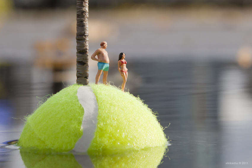
Photographer study: Slinkachu


Slinkachu refers to himself more as a street artist than a photographer; he uses little figures and makes them look big by using a small scale area, he then shows the comparison with the life-size scale.
In-Depth Analysis:
Technical - The aperture must have been very small, around f2.8, on this photo because the focus is soley on the foreground, there is no mid-ground and the background is completely blurred. The small scale of the photo makes the people appear life-size and it makes the tennis ball look like a little island.
I think that this photo was taken with quite a fast shutter speed because there is no motion blur even on the water.
Visual - I like the composition of this photo, I think that the position of the 'props' look good and it makes for an almost comedic photo as the tennis ball is acting as an island and the little people are acting as tourists on the beach.
I think that the colours in the photo reflect the light-hearted, comedic style of the picture. They are vibrant and bright, the colours all go together nicely.
The photo is mid-toned; there are some light and dark but none are extremely contrasting.
Conceptual - The idea behind this photo is trying to make a small scale photo seem like a large scale landscape; small props are used and made to look life-size by the camera position and the crop. I think the concept of this image is interesting and I am going to do something similar using small props in my photos.
Context - Slinkachu, the photographer calls himself a 'street artist' as a pose to a 'photographer'.
He creates small scale scenes and photographs them up close to give them a life-like appearance and then he takes a photo from a normal scale to show the size of the scale in reality.
My photography


I took lots of photos because I had many ideas for scenarious using lego.
I found that because they are lego, it doesn't look as realistic as the figurines that Slinkachu uses but I did the best I could with what I had.
I feel like some of the photos worked better than others, for example, the last three images (blue diver in water) didn't turn out great because I discovered that lego floats and that made it hard to position the figure in the water, I used a blue icepack to try and weigh the figure down but I think this distracted from the fact that the image is taken 'underwater'.
I copied what Slinkachu did, I took 2/3 photos of each scenario and then put a real-life scale photo on the end of the row of each shoot.
Technical - The majority of these photos were taken inside using a flash, I found that at first (the top row of photos) I had the wrong white balance setting and this caused the photos to appear very blue, one I changed the white balance from tuscan light to flash it balanced out nicely.
For the outside photos I had to adjust the aperture and the ISO a lot in order to stop over-exposure, I have found now that I am automatically adjusting my camera settings before taking them depending on my surroundings which is a good habit to get into.
contact sheets and edits


Here I have included my contact sheets, as you can see I took lots of photos which made narrowing it down quite a challenge.
I have also included some simple edits, I wanted the photos as realistic as possible so I didn't make any major changes.
I have also included some simple edits, I wanted the photos as realistic as possible so I didn't make any major changes.
final images


Surrealism
At first I was struggling to find a photograper inspiration for this week, I made a few photos using varies editing apps because I do not have access to photoshop but then after completing a few mediocre edits I wasn't satisfied with the results so I decided to do some more research on surrealism without the use of photoshop.
It was then that I stumbled across the photographer Chema Madoz, who creates surrealist photos that don't have a wow-factor, meaning that they aren't surreal as such (although they are categorized as surreal) but they just have a quirky, unrealistic feel. It is hard to describe the style of these images so I have included a few of his pieces below so you can see what I mean.
He just uses simple things in a creative and clever way to make surreal photography. As soon as I came across his work I loved it and knew that I wanted to recreate and make images inspired by his unique and fun style.


In depth analysis...

Conceptional: This photo is designed to look like an optical illusion and I think that this is an interesting and creative way of portraying surrealism.
The concept of surrealism is subjective in my opinion and I think this photo perfectly represents it.
Technical: This photo doesn't seem to be very depend on camera settings but it does appear to have a large depth of field and as a result of this a large aperture making all distances in the photo in focus.
Visual: This photo doesn't have a great range in tone, all the colours are very low saturation almost making it appear black and white.
There is repetition and use of shapes that make up this photo.
The lighting in this photo appears to be bright but not bright enough to create any harsh shadows, the only shadow is prominent but gentle.
Edits and contact sheets.
Here I have included the contact sheets of my final images, as you can see all the final images have been edited into black and white, this is because I wanted them to be similar to the photographers photos and I wanted a cohesive, monochrome aesthetic series of images.
Below these I have included the edits and final results of the images I created prior to discovering my photographer inspiration, I edited these with a series of different apps as I didn't have access to photoshop and they didn't turn out perfect I think were accetable to include as extras but not as my final images.
I took both the background pictures myself (the sunset and the leaf) but I didn't manage to take an portraits that were suitable so I got both the silhouette and the fairy off of google.


My final images
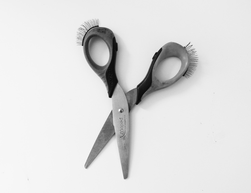
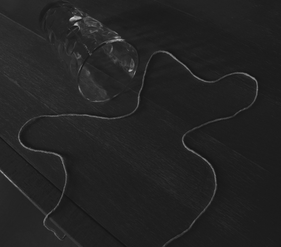
Below are my final images, they are all edited into black and white and this was the only editing adjustment I made to them, all the exposure was correct when I took the photos.
Some of the photos are impressions of photographs by Chema Madoz while some of them are my own creations that I thought up and made myself.
These photos were obviously all staged and so I had to set up the scene before each one was taken, some of them took longer than other (applying the fake lashes to the scissors was very difficult!) but they were all fun to do and I am happy with how they all turned out. My favourite is the cigarette and the pencil sharpener.